Turning playful energy into a scalable brand system
[Client]
SNACKS LOVERS
01 / [CONTEXT]
Fearless snack culture and sweet energy
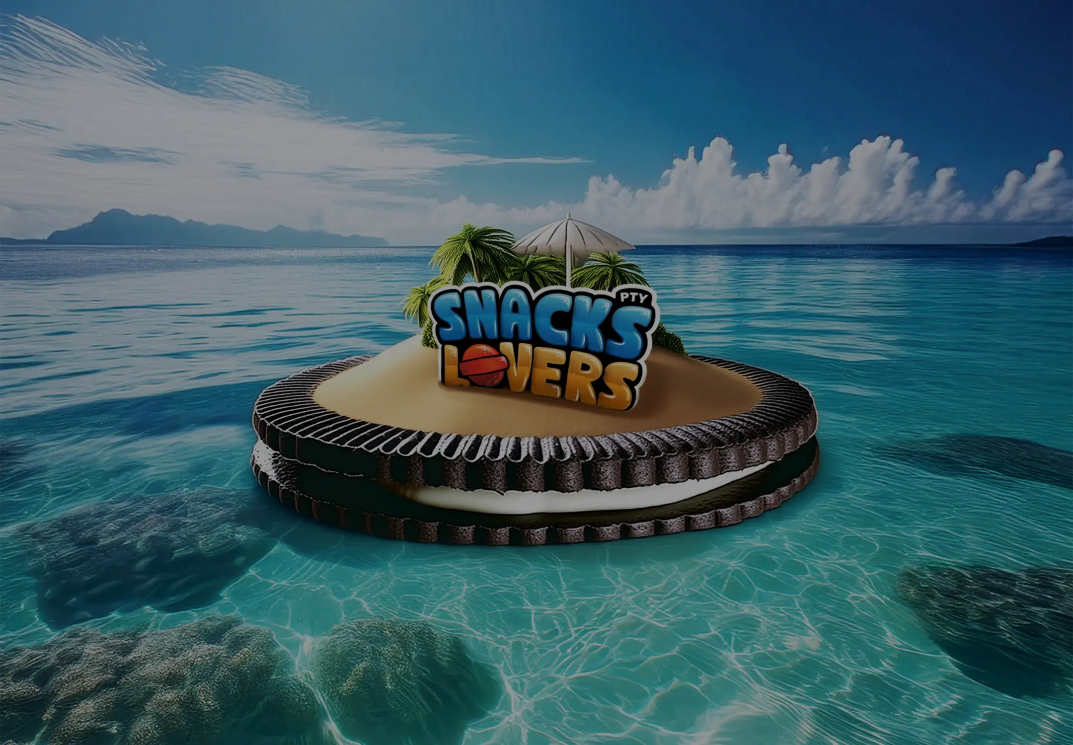
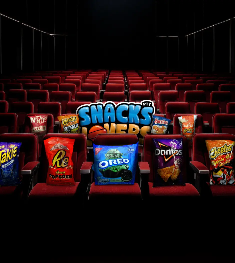
Panamanians love snacks, and many of the best ones are from the United States. Crunchy cookies and chips, sweets for every taste, sugary cornflakes, and much more! Delicious, right? We all love it. That's why Snacks Lovers is a leading supplier of American snacks in Panama. While creating these cool things, we focused on crafting the logo to align with the feelings and emotions that Snacks Lovers brings to its customers. It evokes a lot of sweetness, love, and yummy! All of this was achieved with excellent brand guidelines that build consistency so the brand looks much stronger and stays in customers' minds.
- Service
- Brand Strategy, Visual Identity, Rebranding
- Industry
- FMCG, E-commerce
- Market
- Panama
- Year
- 2026
02 / [SYMBOL]
A conversation between taste and emotion
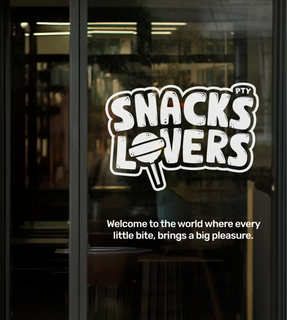
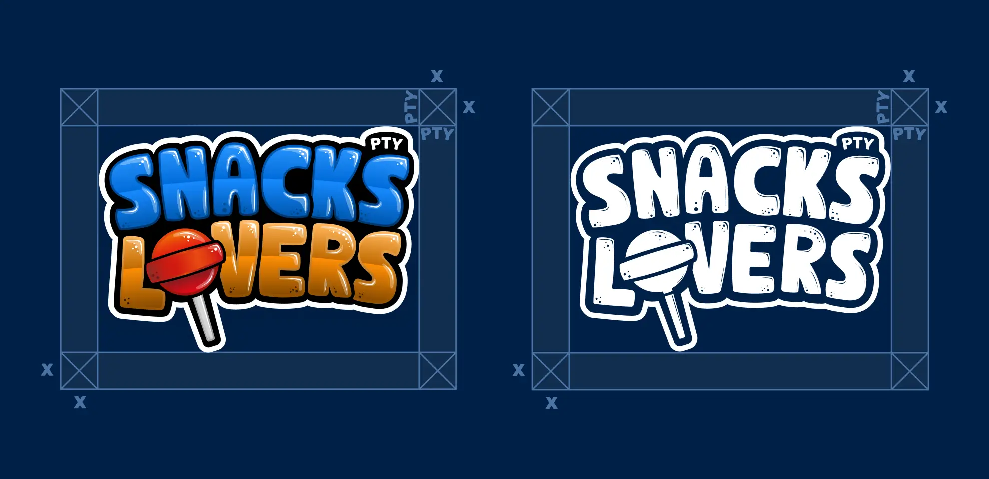
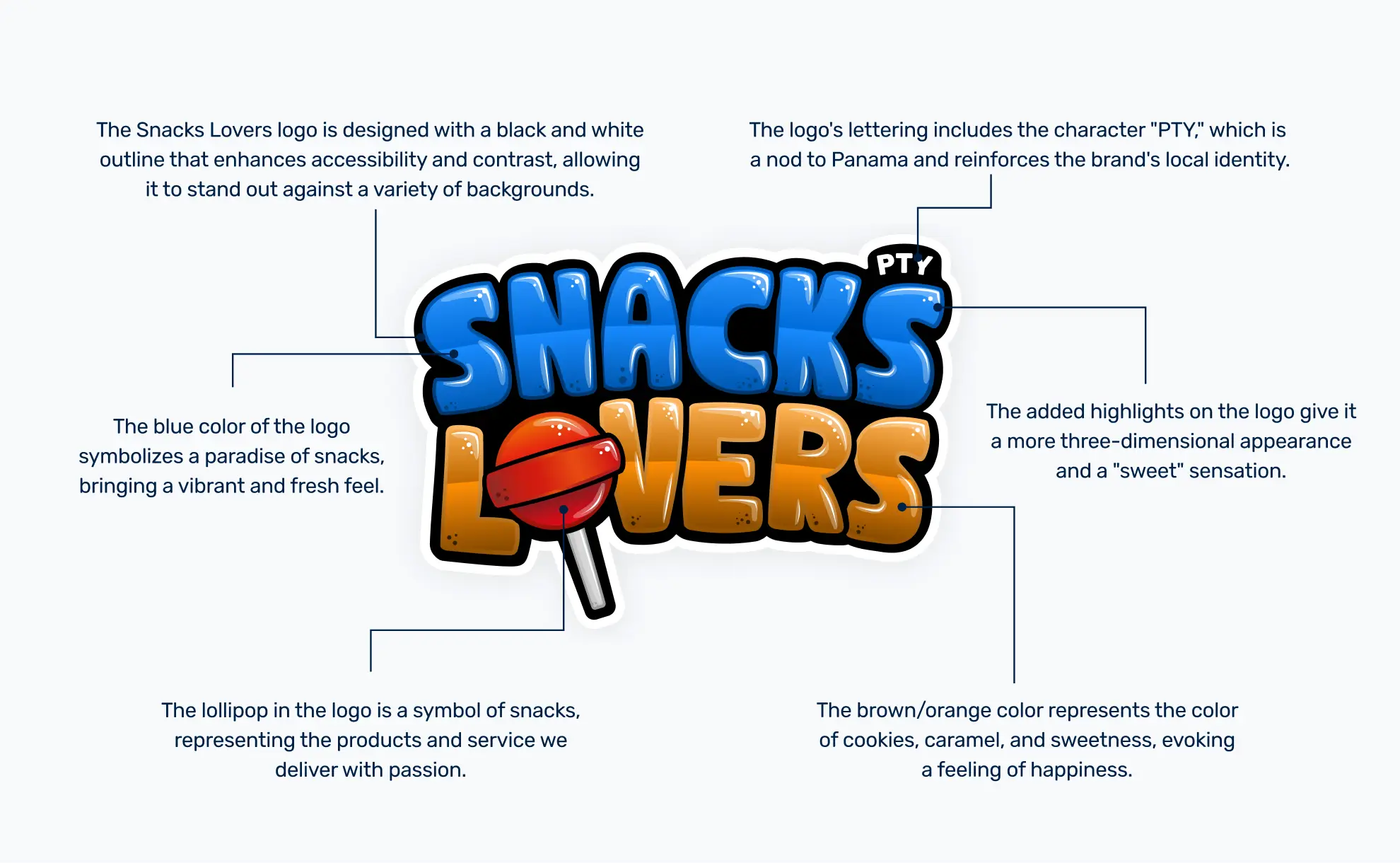
The logo itself is a playful conversation between Snacks and Lovers, where the o playfully transforms into a lollipop – a sweet nod to the variety of goodies they offer. It's designed to connect with people on a gut level, that instant craving for something delicious. While bursting with flavor and personality, the logo's core design remains adaptable. Its black and white outline ensures it pops on any background, making it consistently impactful. We've also defined a safe zone around the logo. This isn't about restriction, but about giving it breathing room so it always shines, no matter what other visuals are around it. Think of it as its personal spotlight.
03 / [STYLE]
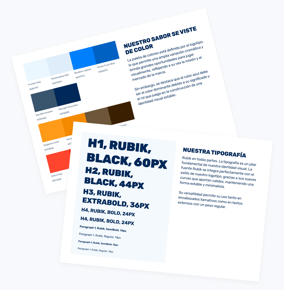
Color, typography and the digital candy store
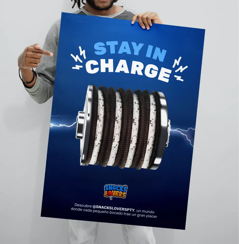
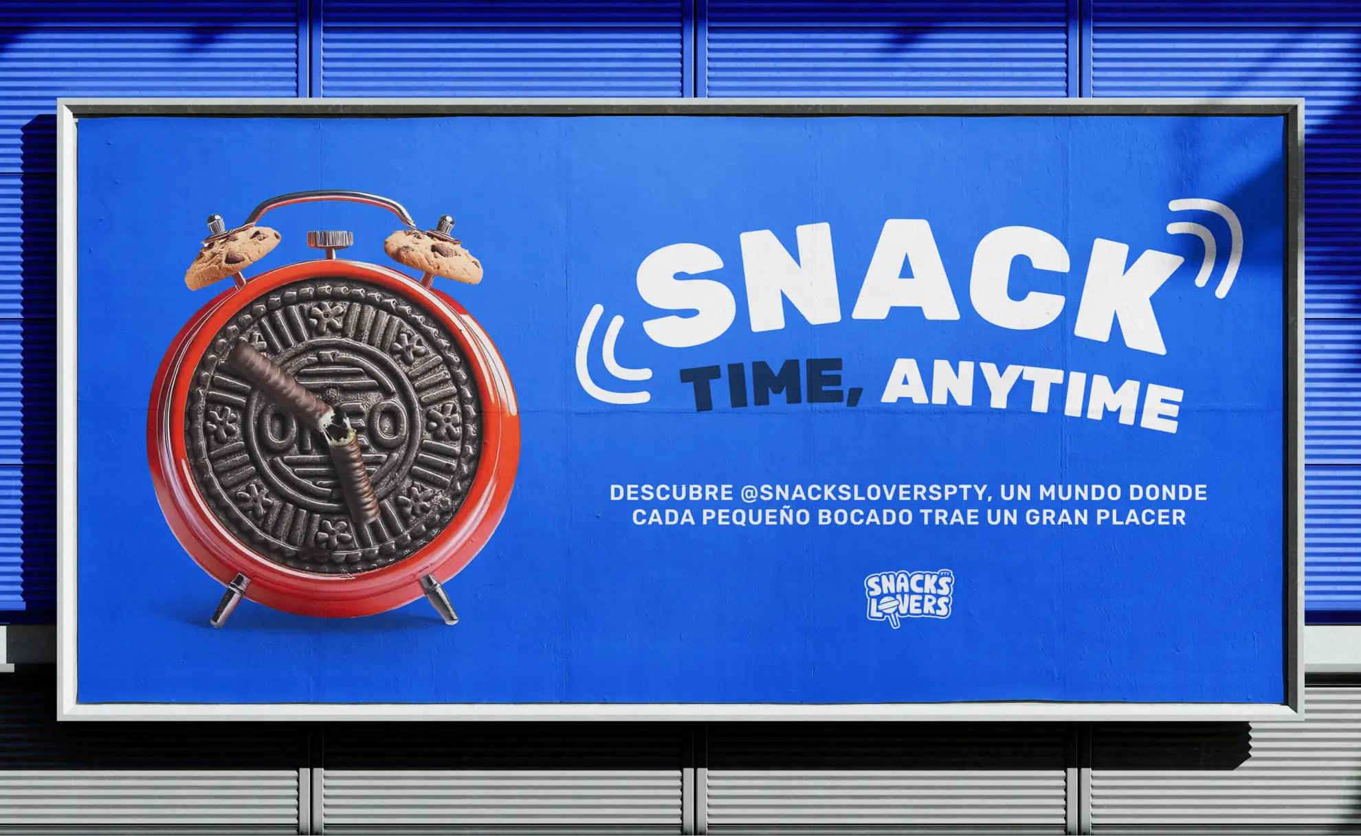
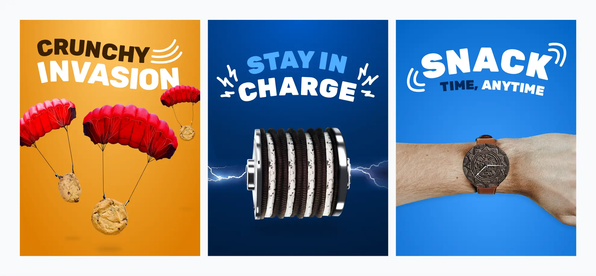
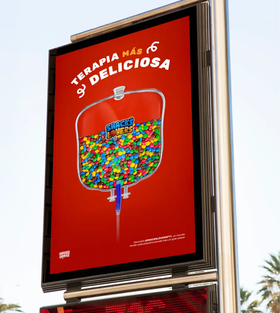
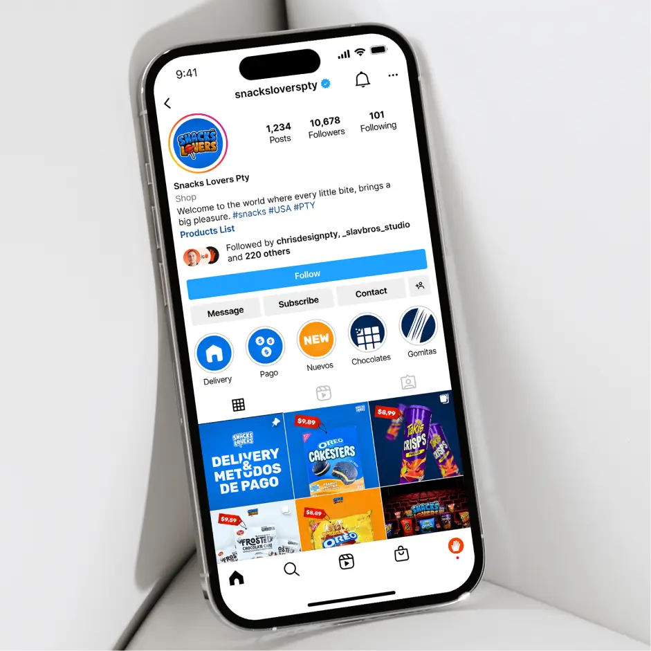
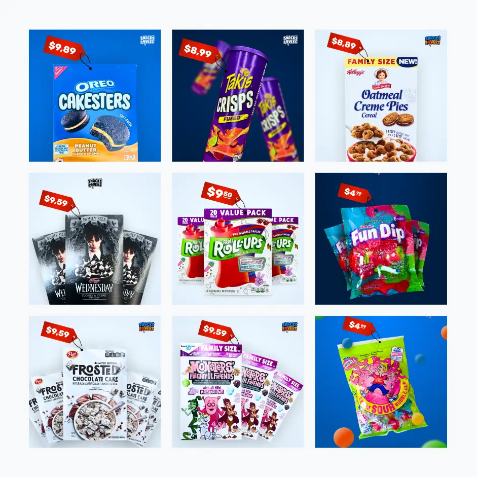
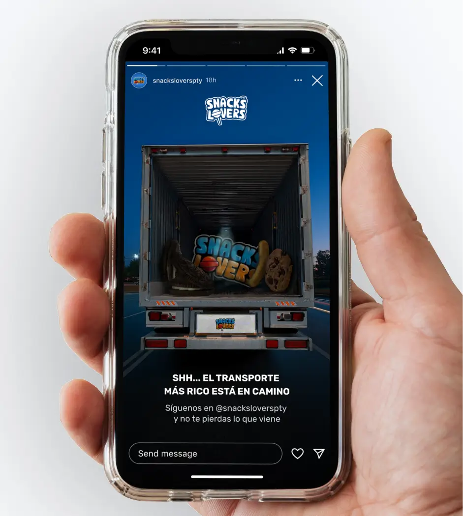
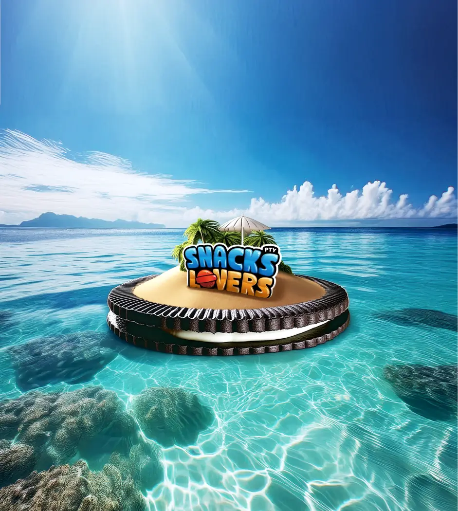
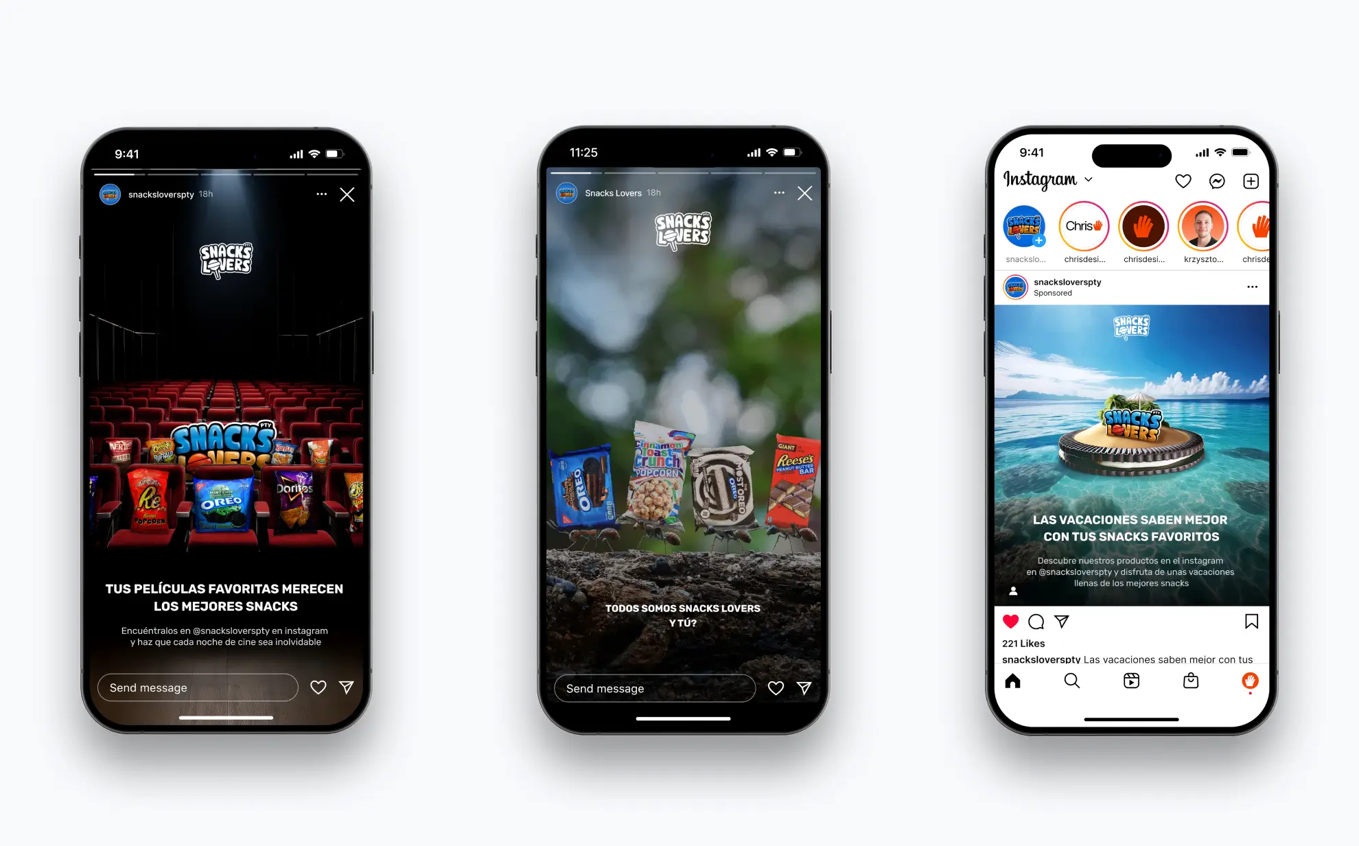
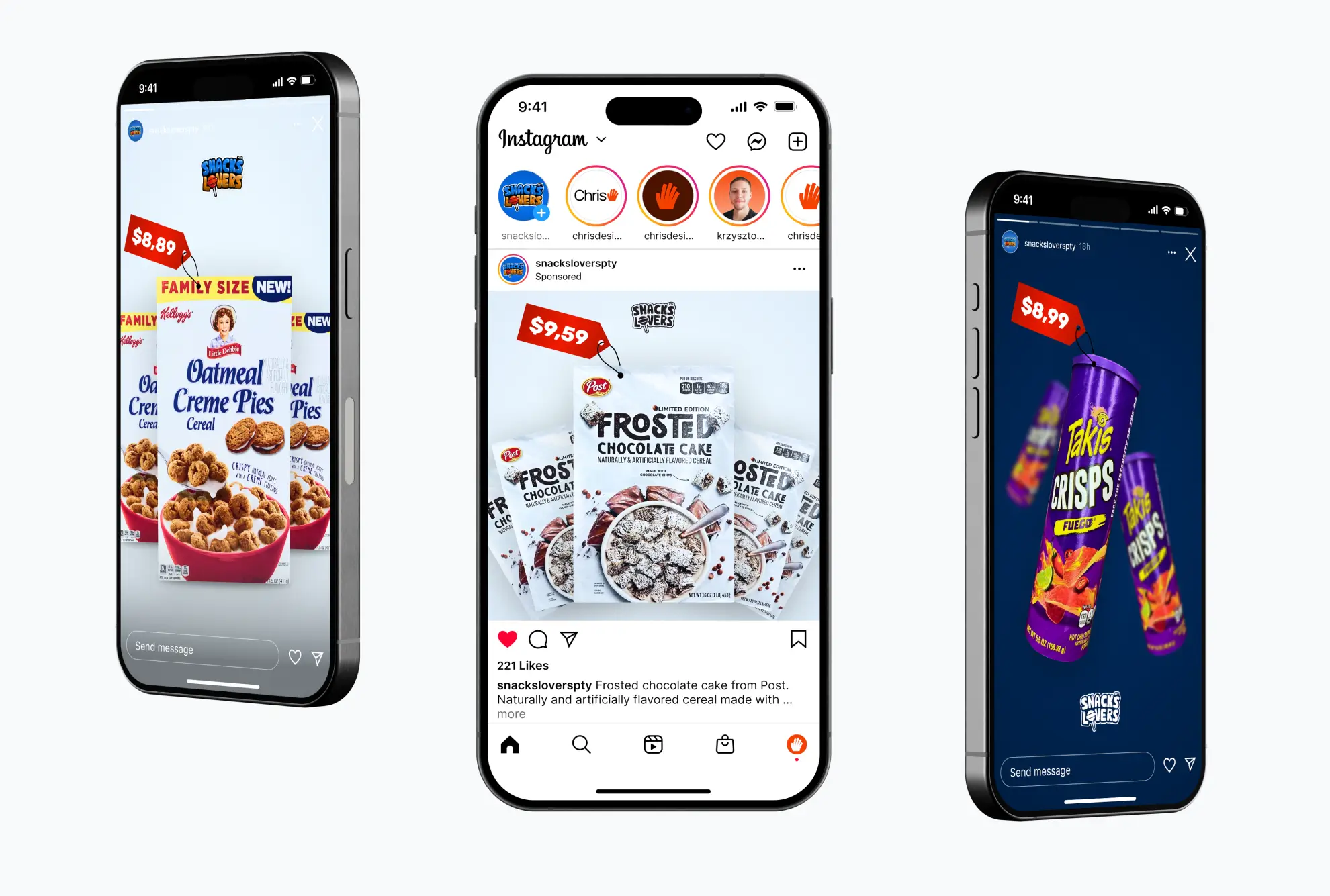
The color story for Snacks Lovers starts with the logo's energy, allowing for a flexible palette that mirrors the diverse world of snacks. However, a strong blue acts as their anchor – a visual cue for trust and stability in all that deliciousness. Typography plays a supporting role, with Rubik being their go-to font. Its gentle curves echo the sweetness of the brand, while its clean structure keeps things modern and easy to read, whether it's a bold headline or a longer caption. Instagram is where Snacks Lovers truly comes to life. It's their digital candy store. To keep everything looking as tempting and cohesive as their snacks taste, we've developed a set of visual guidelines for all their content. It's about creating a consistent visual feast that's instantly recognizable.
04 / [IMPLEMENTATION]
Packaging, stickers and retail touchpoints
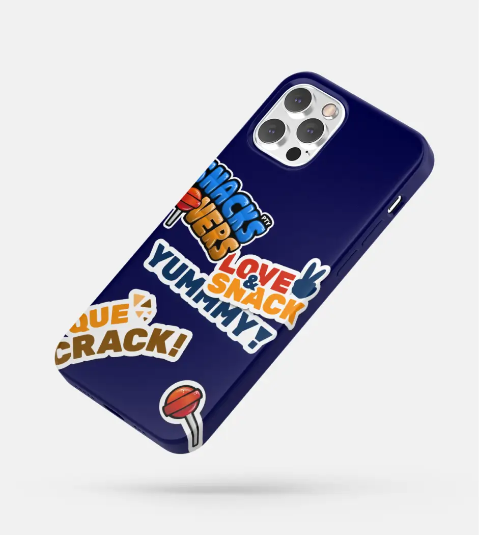
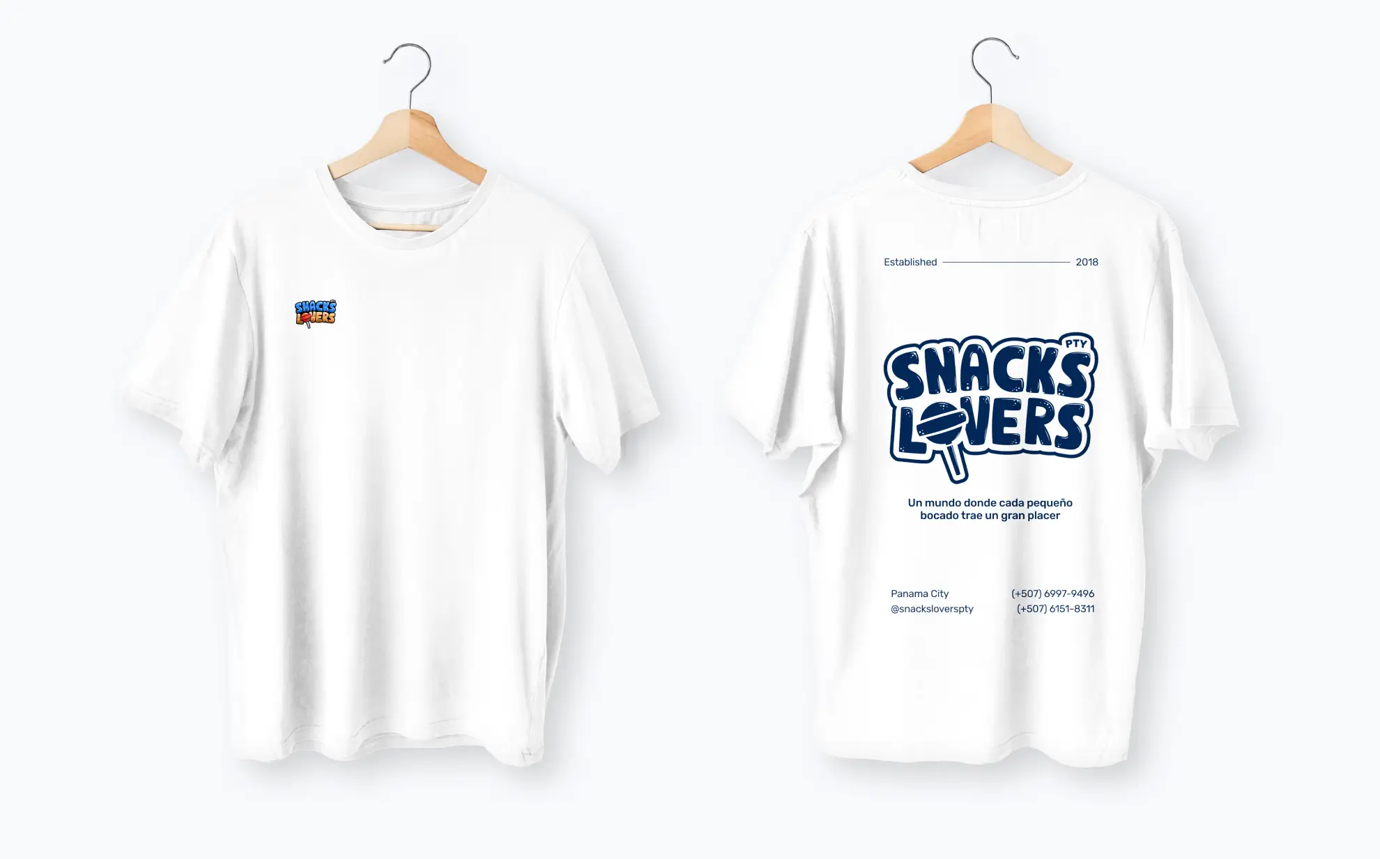
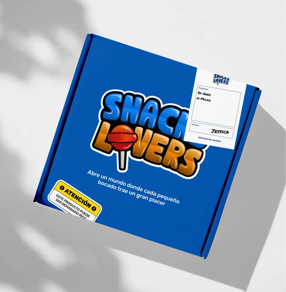
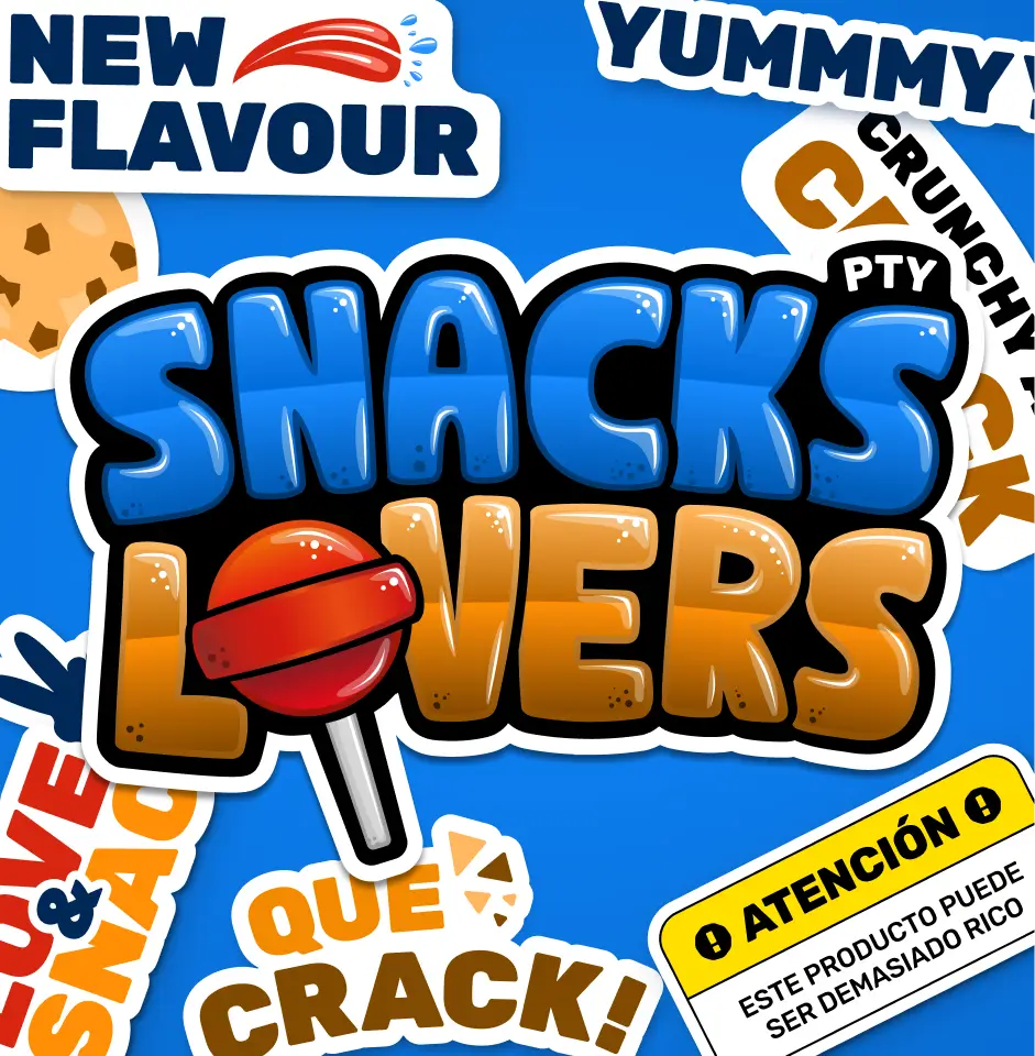
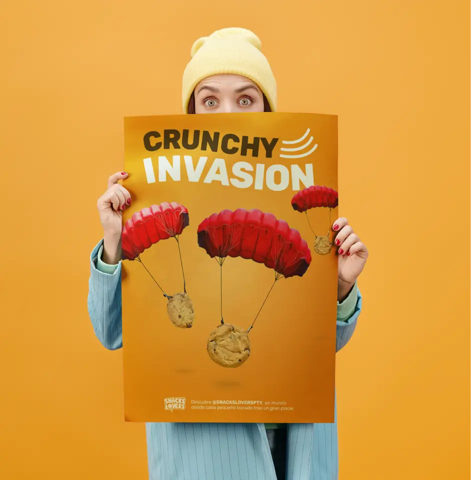
Key promotional elements include lifestyle stickers designed to be desirable and applied on phones, laptops, or notebooks to organically expand brand visibility. Additional promotional materials feature custom packaging solutions and promotional cards, each engineered to reinforce the brand's identity and core mission.