A New Visual Identity for Panama’s Premier Free Trade Zone Authority
[Client]
AGENCIA PANAMÁ PACÍFICO
01 / [CONTEXT]
Rebranding a Key Government Hub for International Investment
Agencia Panamá Pacífico is the state authority managing the Panama Pacífico Special Economic Area, one of Latin America’s most prominent trade and logistics hubs. By offering competitive tax incentives and dedicated infrastructure, the zone attracts global enterprises such as Dell and Huawei to establish regional headquarters.
The agency's legacy identity had remained unchanged for more than twenty years. As the zone expanded, the existing visual presence failed to reflect modern commercial standards, projecting an outdated, bureaucratic image rather than an efficient business facilitator. The leadership turned to us to build a contemporary identity aligned with their operational standard.
- Service
- Rebranding
- Industry
- Government Sector, Special Economic Zones, Public Administration
- Market
- Panama
- Year
- 2025
02 / [CHALLENGE]
Moving from Bureaucratic Stereotypes to Business Partnership
Initial research revealed that the legacy identity suffered from a lack of standardization, low visual contrast, and obsolete social media layouts. This rigid aesthetic reinforced investor fears of bureaucratic friction and slow administrative processes, hindering effective promotion.
Based on these findings, we defined the core rebrand objective: shifting from a conventional public office model to an agile, corporate-grade entity. The challenge required balancing state authority with business efficiency, while showcasing the zone’s unique green, eco-friendly environment.
03 / [SYMBOL]
Merging Panama’s Geography with Fluid Administrative Processes
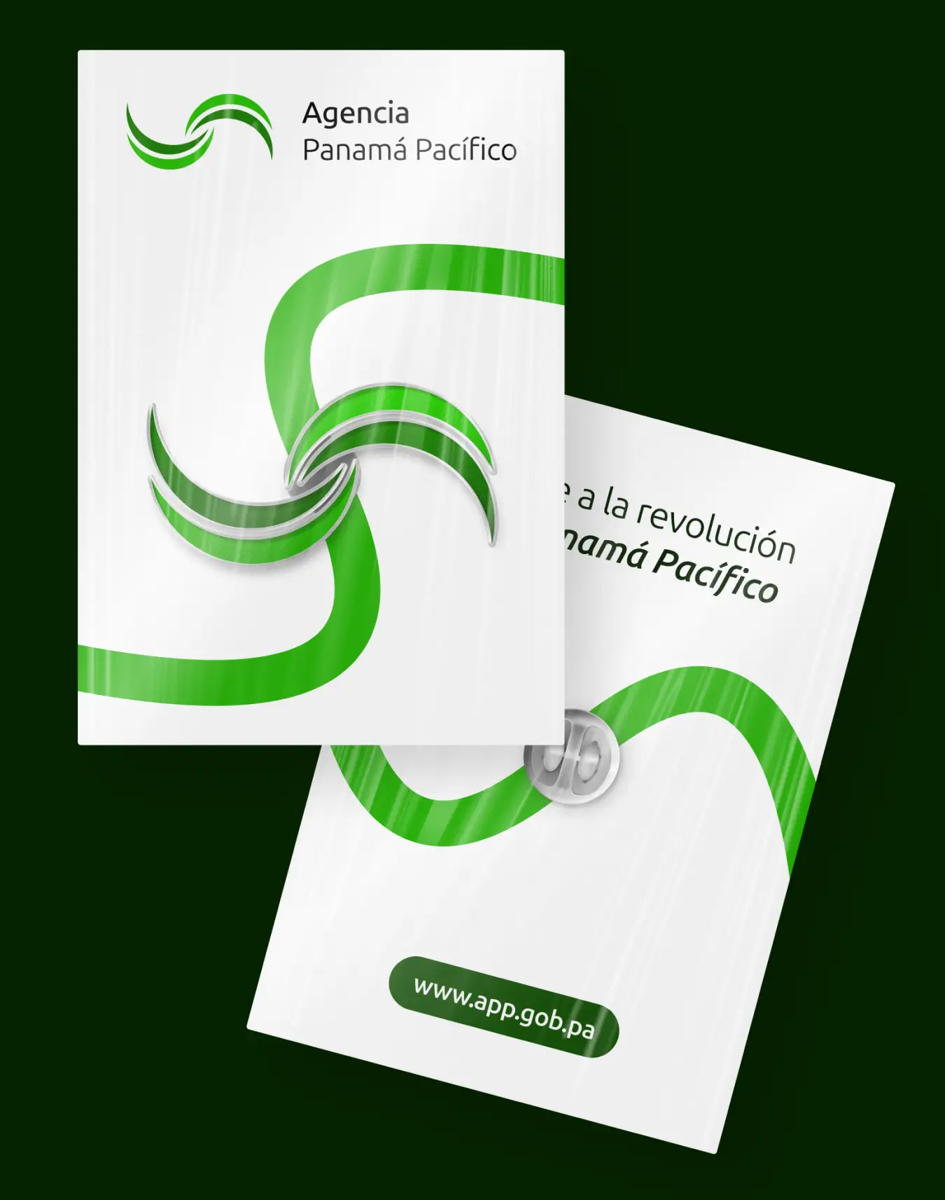
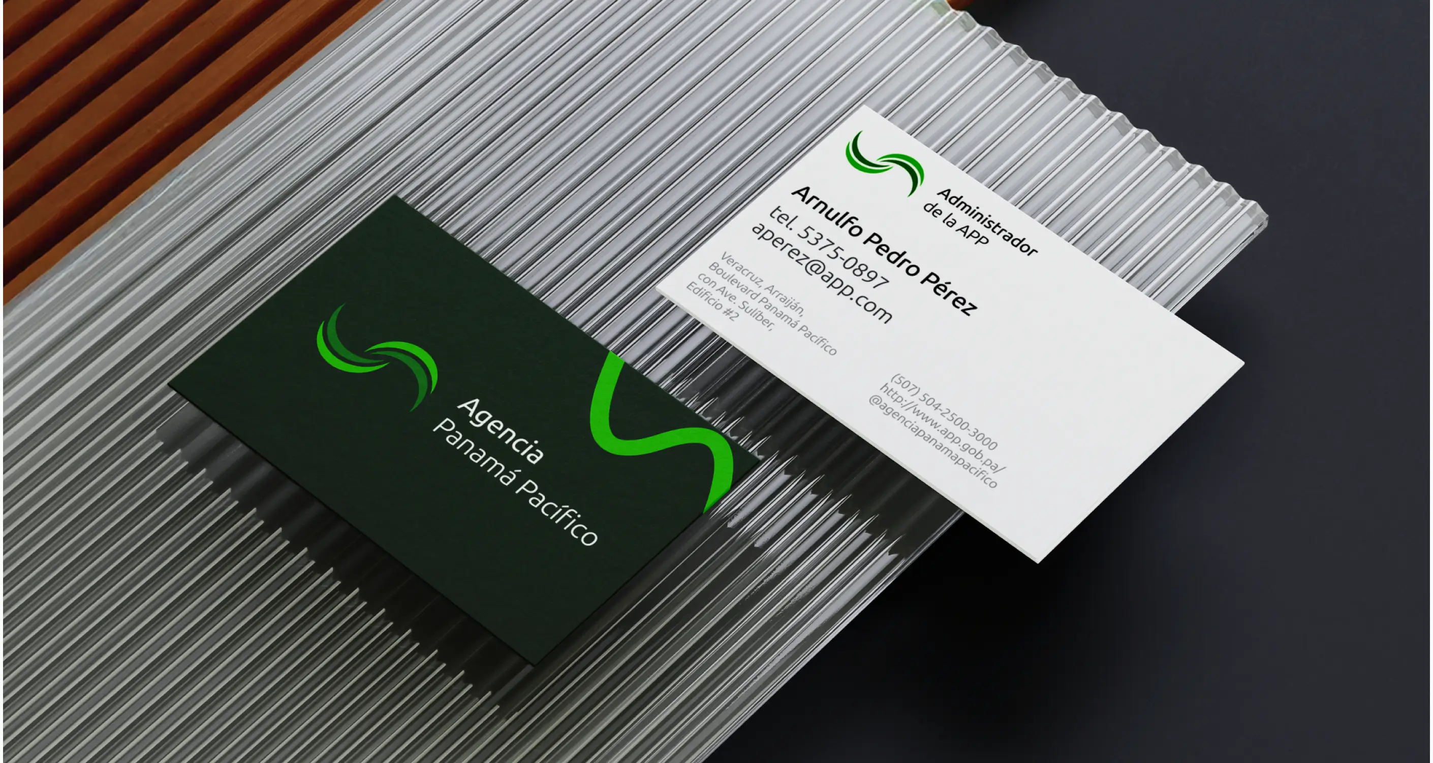
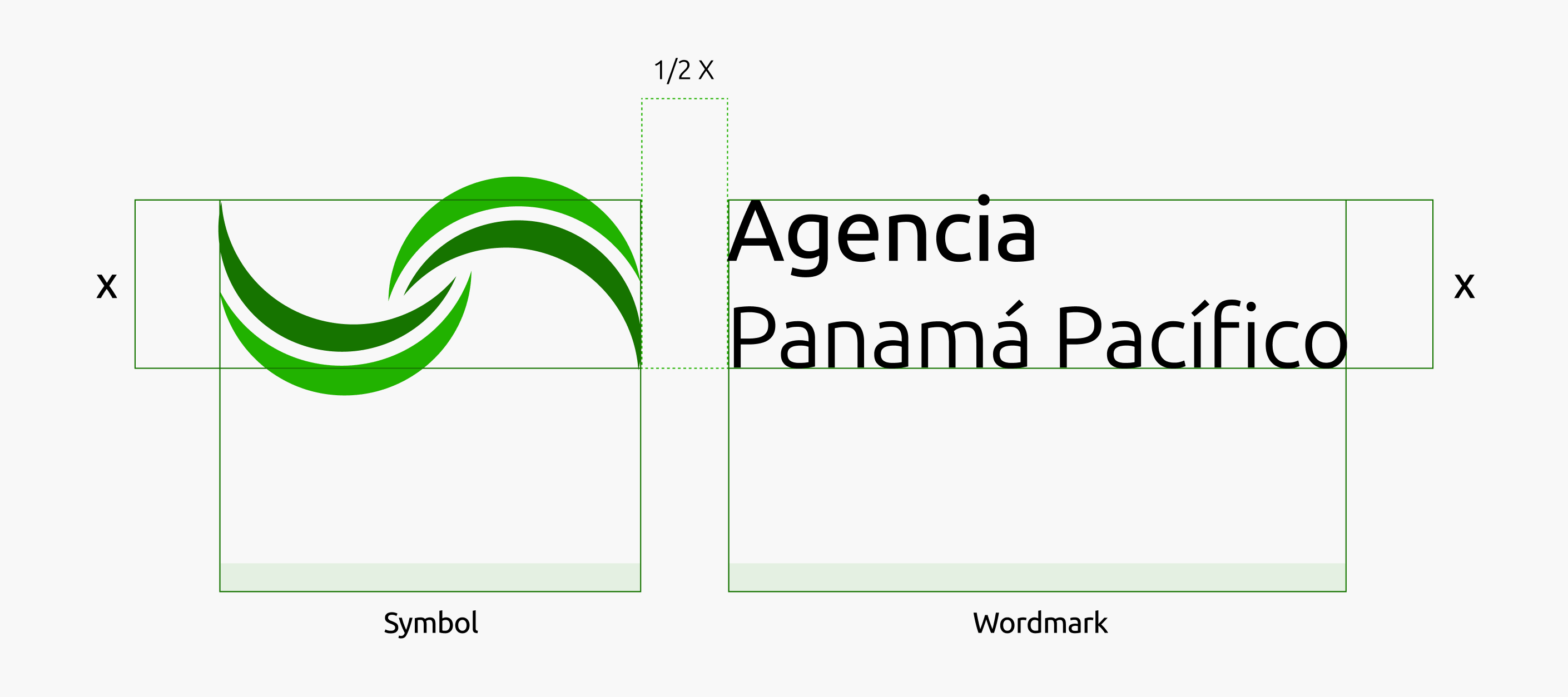
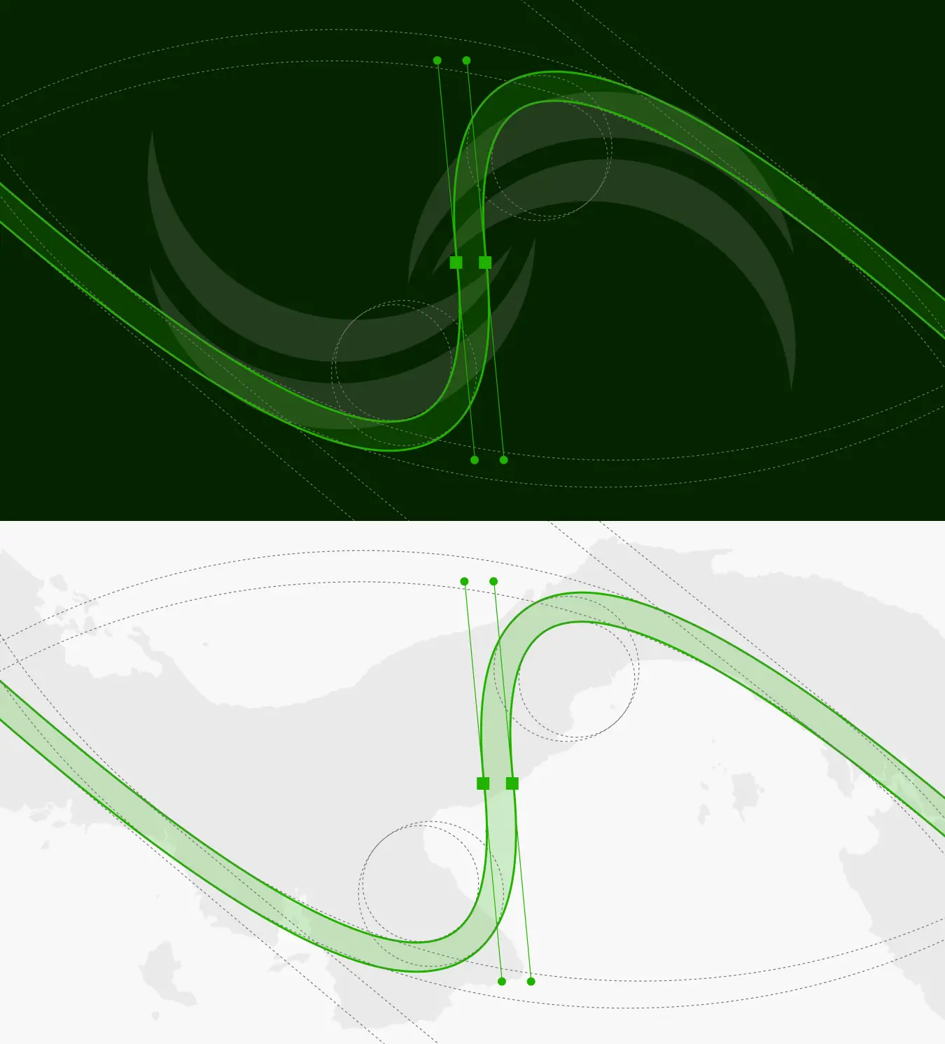
We approached the logo redesign by seeking a geometry that conveys authority without rigidity. The resulting symbol features two cylindrical wave lines shaping the geographic outline of Panama. The inward fluid movement represents the zone's status as a central hub for regional and global trade.
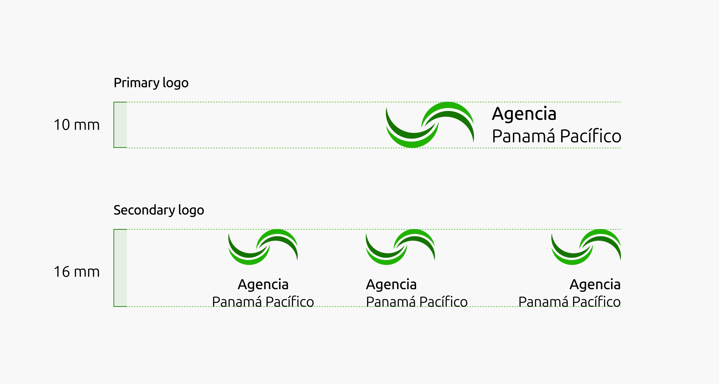
Simultaneously, the underlying circular geometry references a roundtable—an established symbol of governance, administrative continuity, and institutional partnership. The mark is accompanied by a functional wordmark crafted for both primary and secondary layouts to ensure versatility.
04 / [SYSTEM]
Accessible Typography and a Sustainable Color Palette
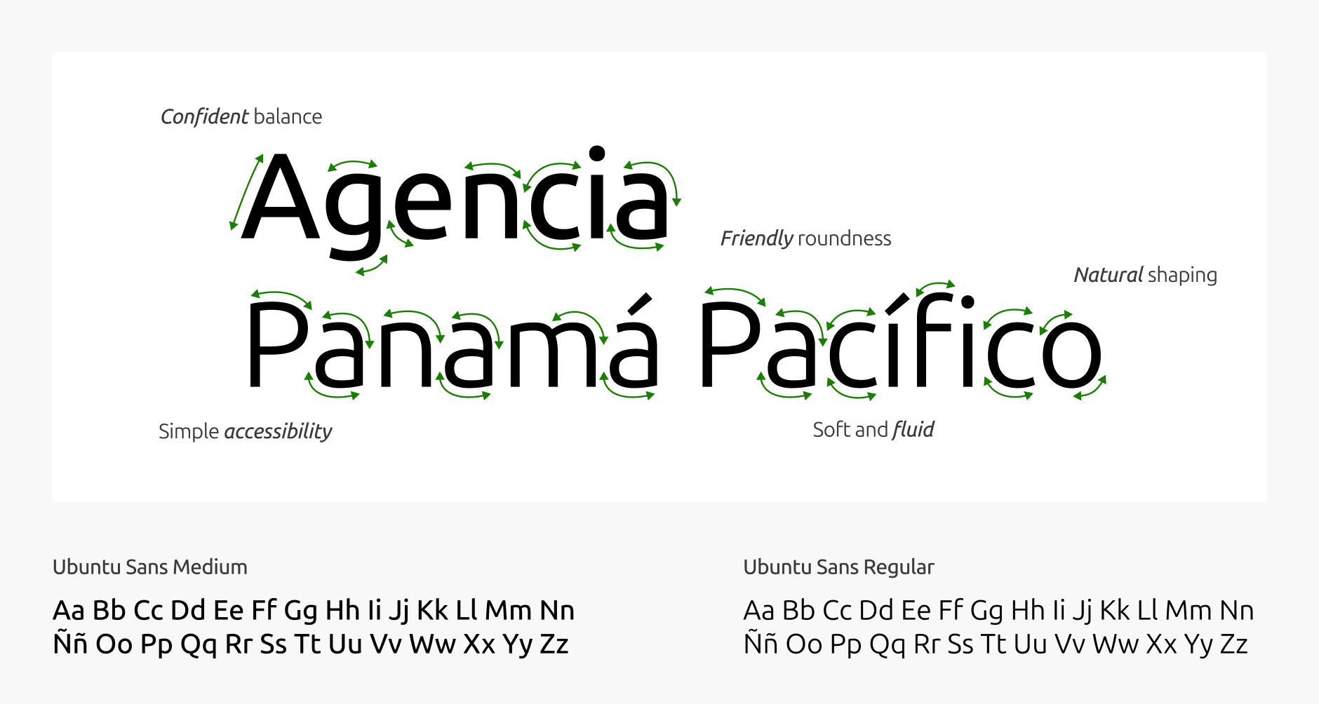
For typography, we selected Ubuntu Sans. Its rounded letterforms complement the fluid wave motif of the symbol, balancing corporate structure with an approachable aesthetic.
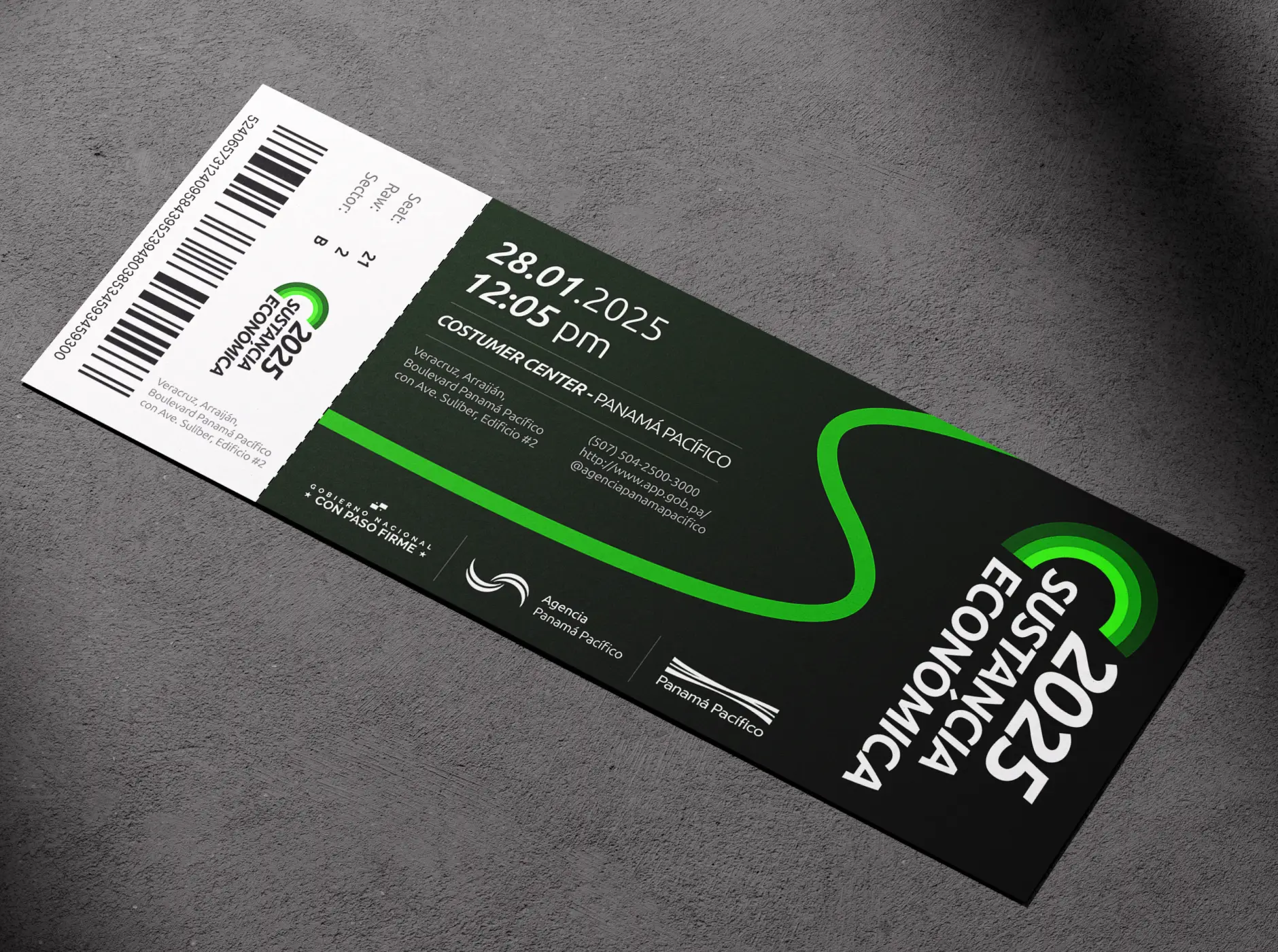
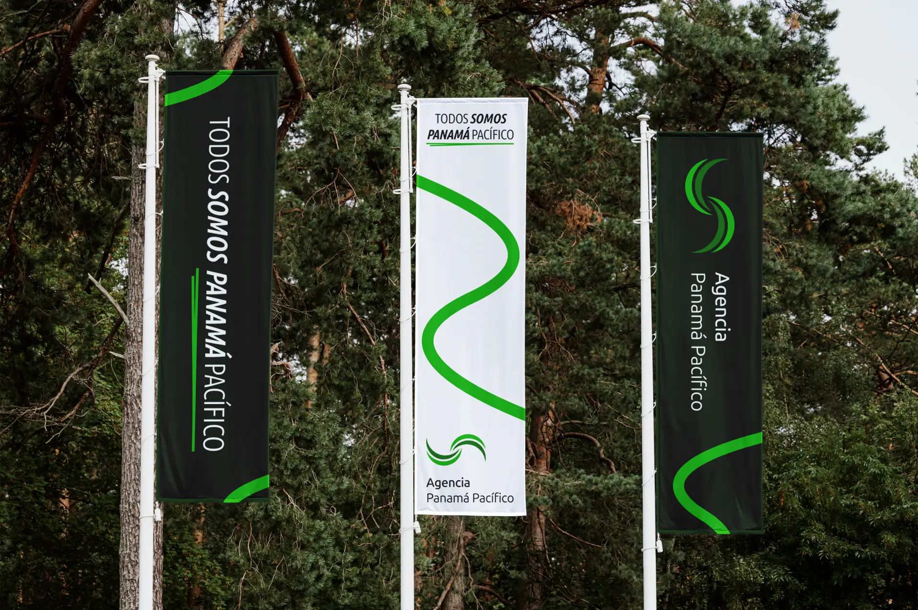
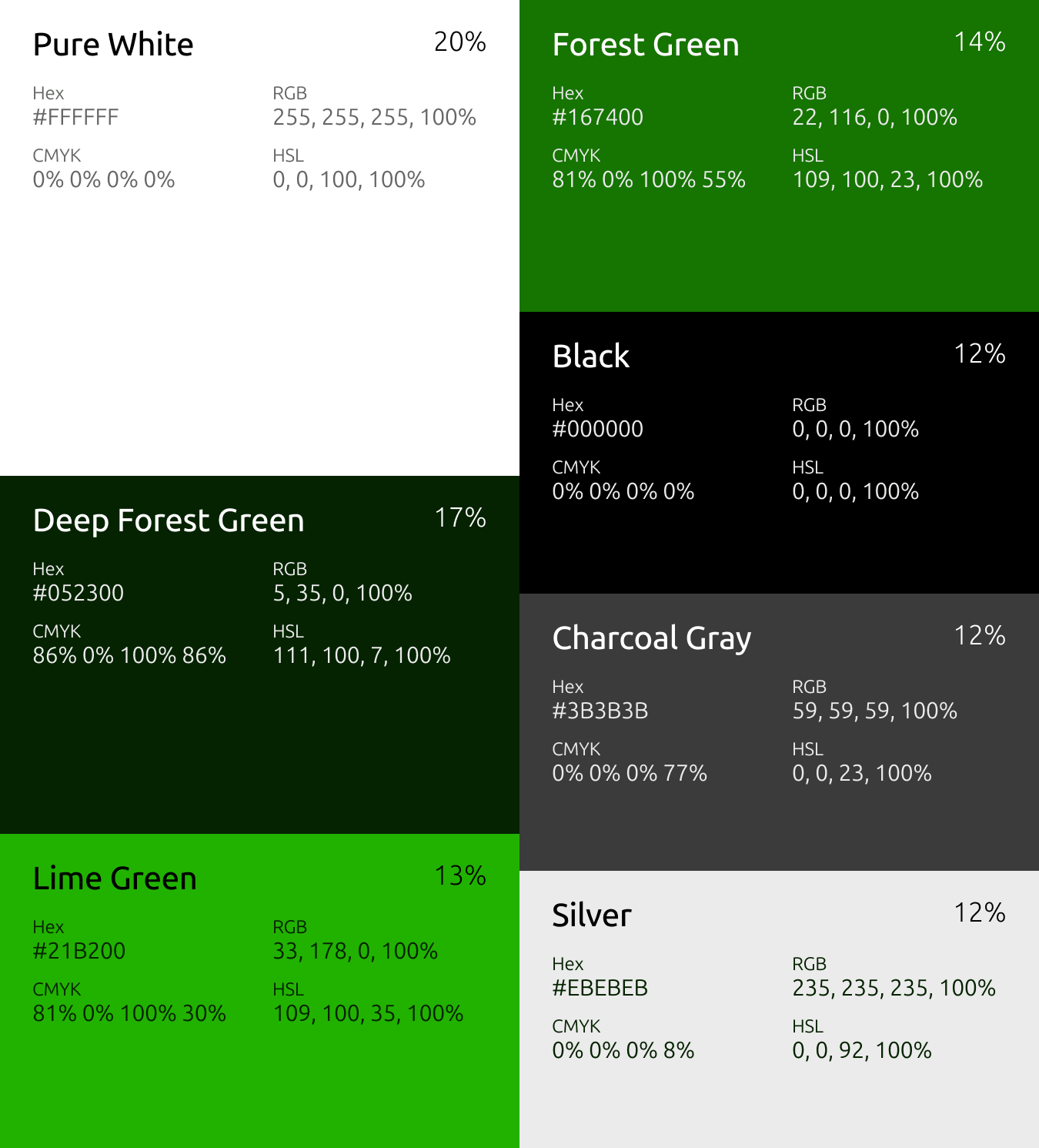
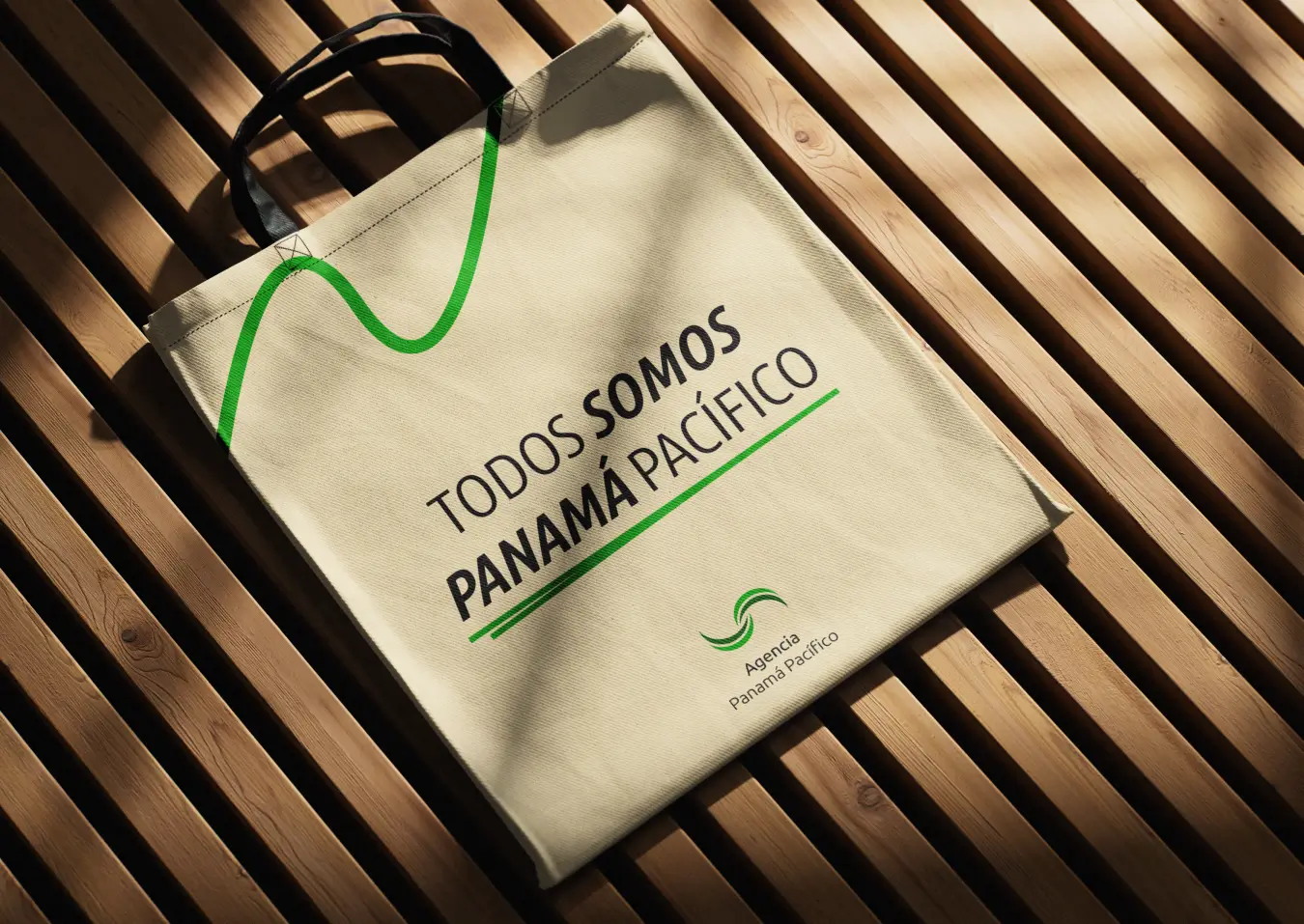
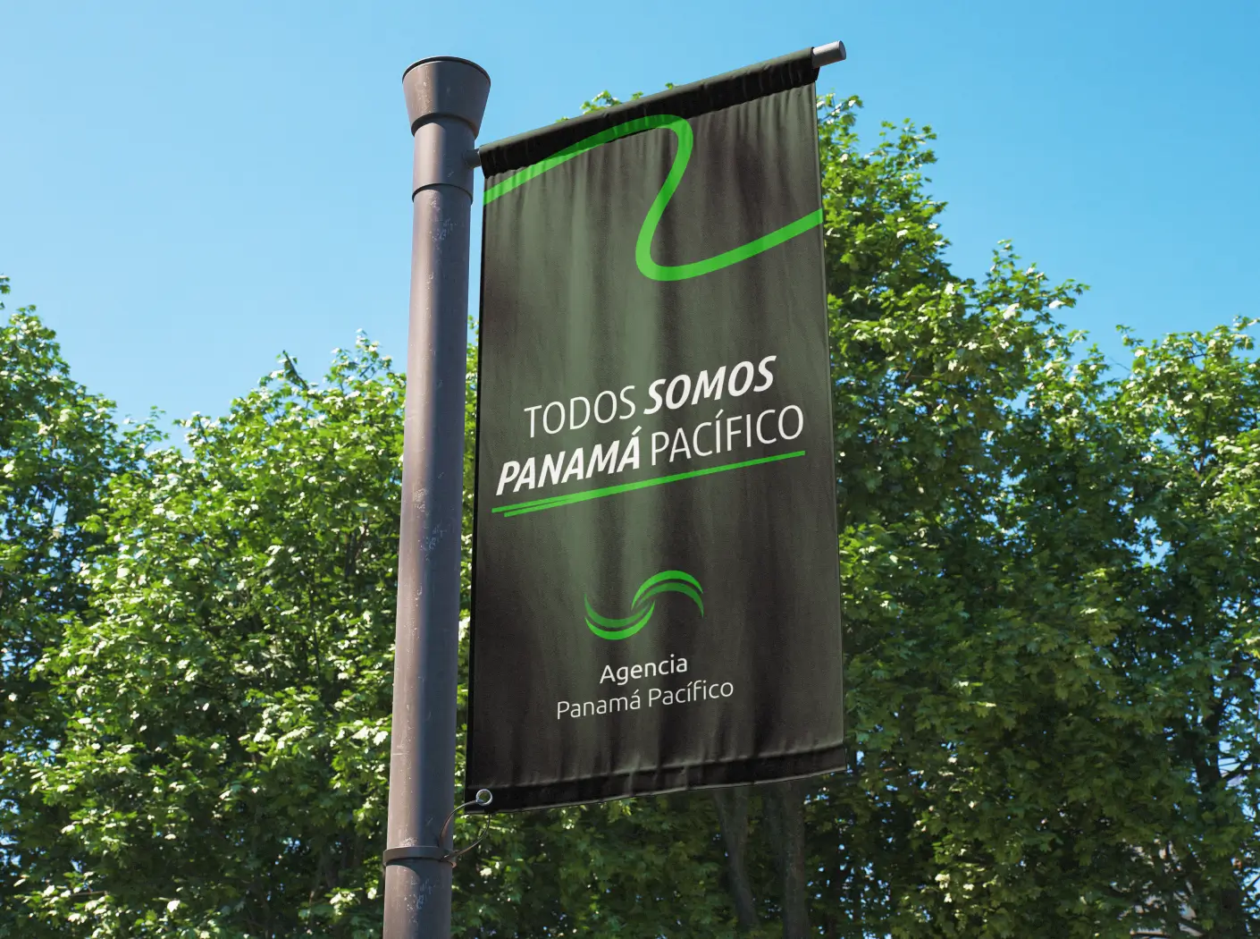
We replaced the former low-contrast palette with a structured system based on two distinct greens: Forest Green and Lime Green. This update eliminated digital accessibility issues while highlighting the natural environment of the zone. Additionally, we introduced a dynamic wave line as a core supporting graphic asset across all brand touchpoints.
05 / [STRATEGY]
A Shared Motto Building Community and Alignment
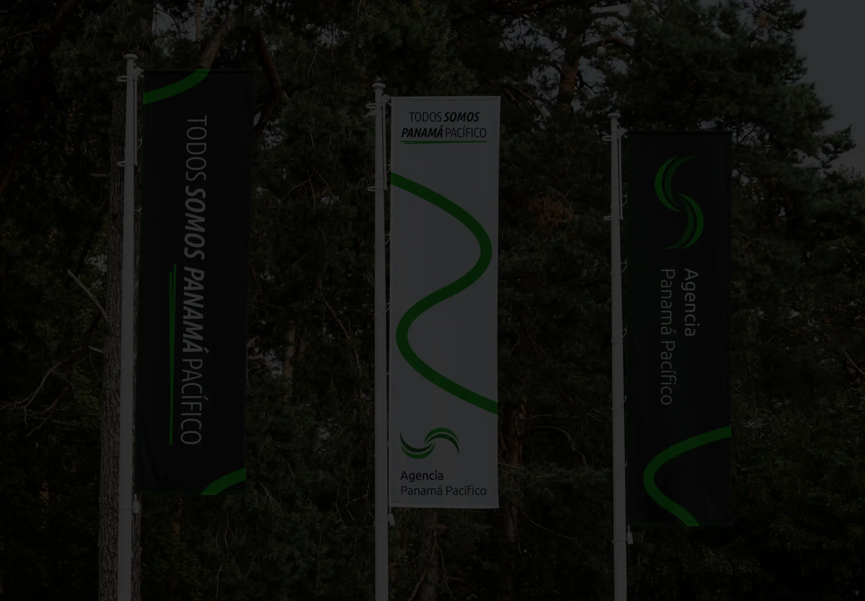
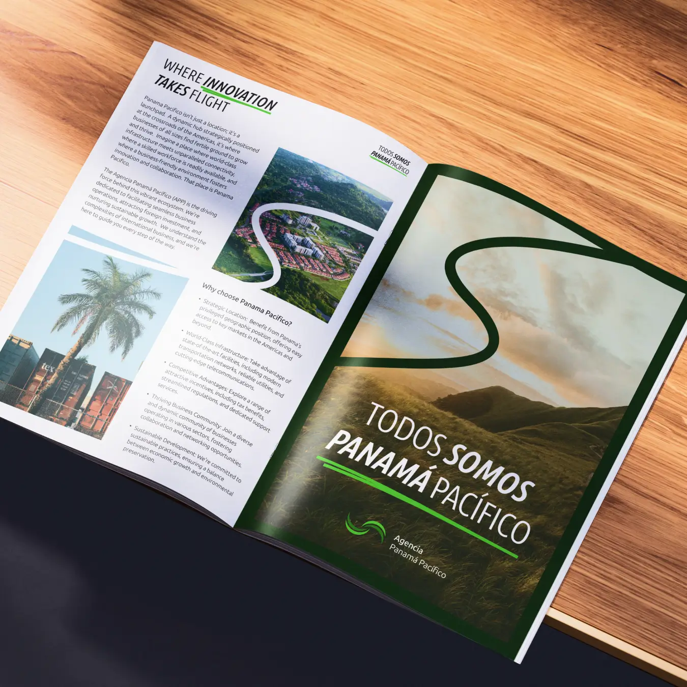
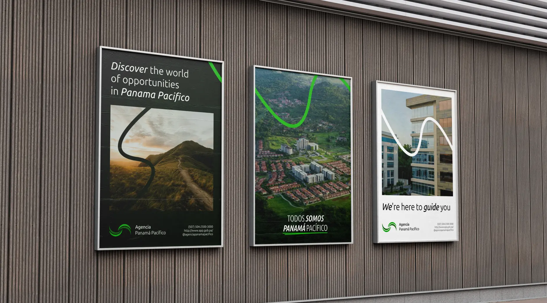
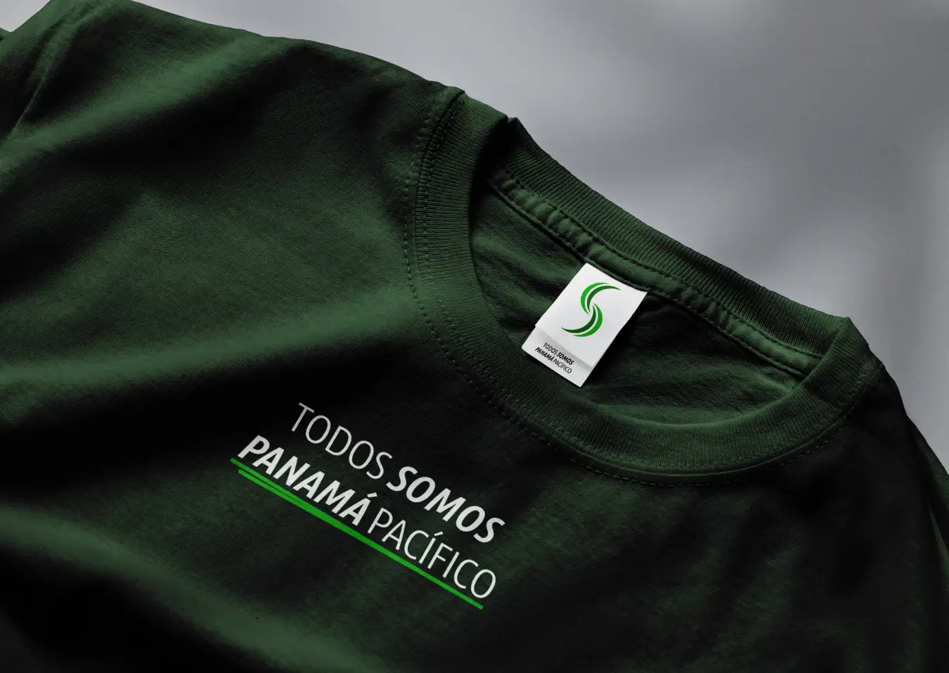
To anchor the brand positioning, we introduced the core motto “Todos somos Panamá Pacífico”. The tagline utilizes Ubuntu Sans Condensed with italicized accents to create a distinct visual treatment within the typography system.
This messaging pivots the narrative from an isolated government entity to an inclusive ecosystem uniting investors, businesses, and residents. The motto was integrated across all official communications and promotional materials.
06 / [COMMUNICATION]
Standardizing Digital Channels for Corporate Audiences
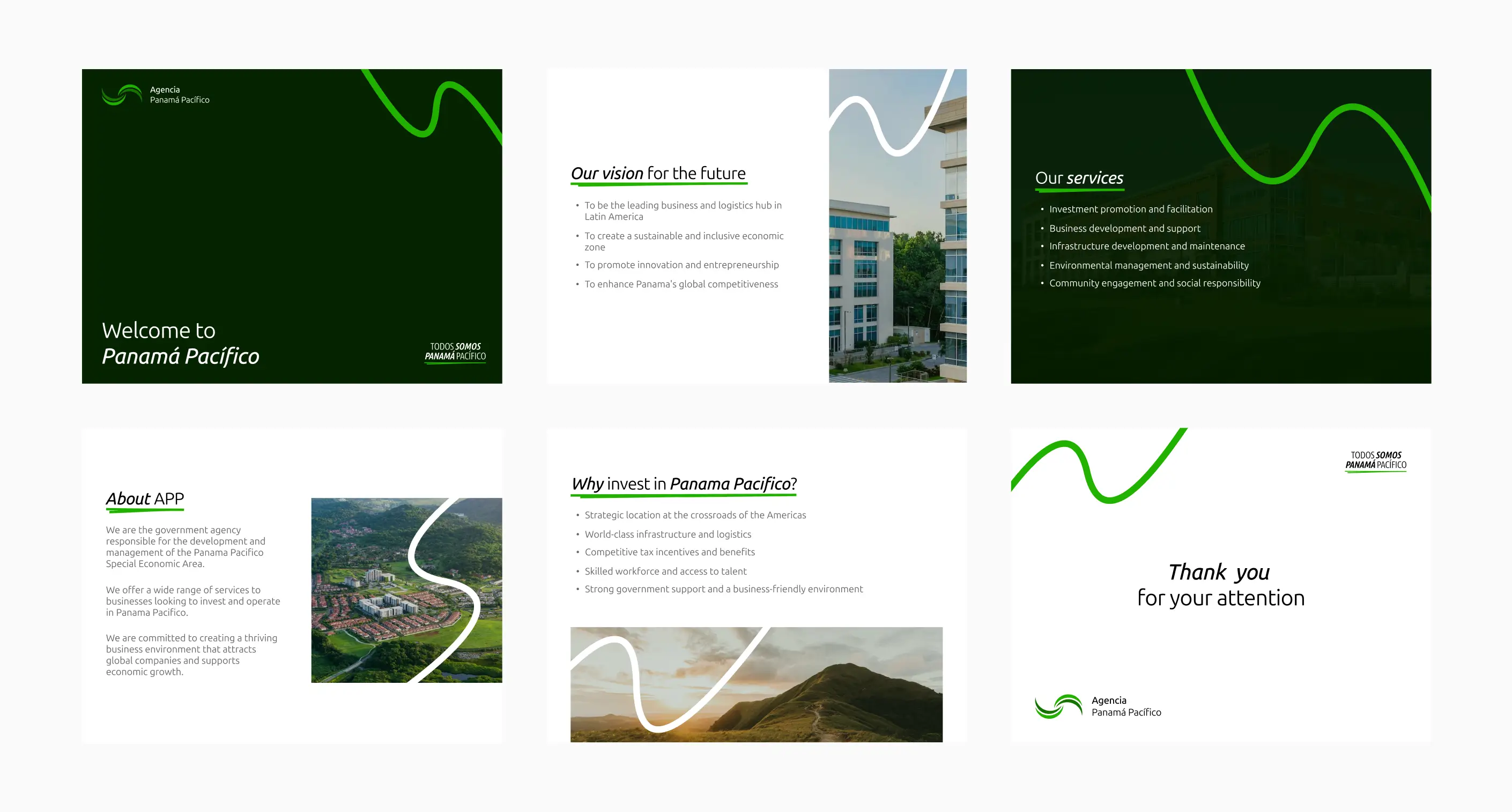
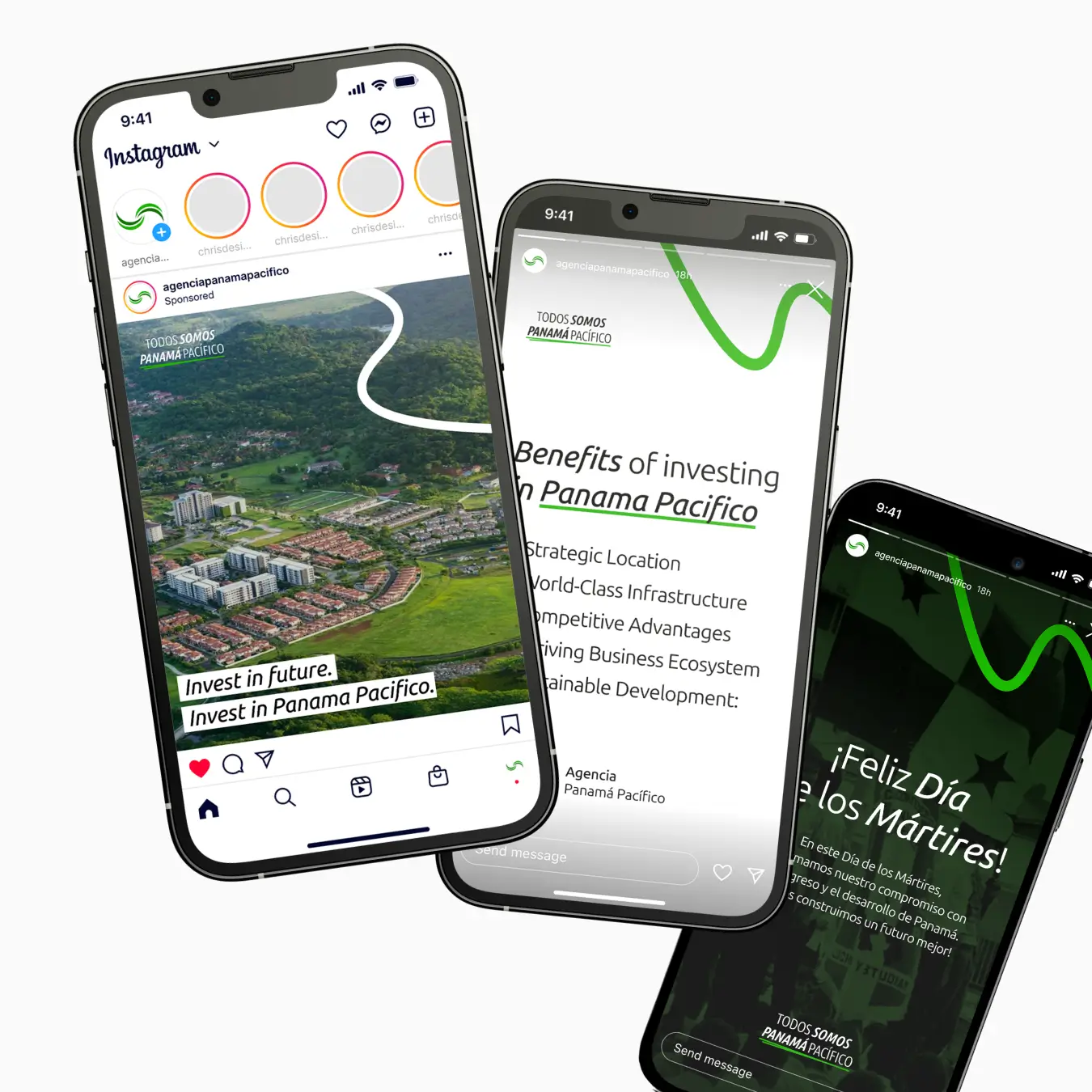
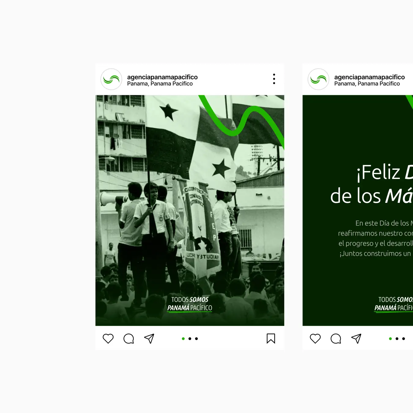
Prior to finalizing the comprehensive brand guidelines, we created a standardized social media template framework. We replaced disjointed posts with clean, structured grid systems focused on clarity and professionalism.
As a result, the agency’s digital communication aligned with the expectations of corporate decision-makers, effectively balancing business incentives with lifestyle benefits in the zone.
07 / [SUMMARY]
Comprehensive Brandbook and Strategic Framework
The project concluded with the delivery of a complete Brandbook and strategic framework. We documented brand positioning, core values, tone of voice guidelines, and technical specifications for logo usage, color palettes, and typography.
Ultimately, we provided Agencia Panamá Pacífico with a complete identity system that transformed an outdated public image into a cohesive, corporate-grade brand. The new system establishes the agency as a reliable, modern partner for global investment.