High-Tech Brand Identity for Panama’s Access Control Provider
[Client]
NRV CONTROL SYSTEMS
01 / [CONTEXT]
Moving Past Two Decades of Visual Stagnation
For over twenty years, NRV Control Systems has supplied Panama’s commercial sector with access control hardware and security infrastructure. While their technical execution earned them market authority, their visual presence fell behind their current product capability. The regional market remained dominated by small distributors using repetitive graphics. NRV decided to break away from standard industry visuals to set a high-tech benchmark in Panama.
This long-standing market inertia resulted in historical branding that suffered from visual clutter and inconsistent color usage. These flaws directly weakened buyer trust during high-stakes corporate procurement. Disconnects between social media channels and their main web platform created additional friction. NRV needed a sharp visual framework built on clarity and systems-level thinking.
- Service
- Strategy, Identity, Rebranding
- Industry
- Security & Control Systems
- Market
- Panama
- Year
- 2026
- Live
- nrvsystems.com

02 / [STRATEGY]
Defining Core Pillars Through a Focused Sprint
We initiated the process with an intensive Brand Sprint alongside NRV’s key team. As a compact studio, we replace agency overhead with direct collaboration and practical logic. Together, we mapped the operational requirements of technical directors and facility managers evaluating critical infrastructure.
Building directly on these operational requirements, our moodboard testing established the concrete visual system. The direction prioritized functional layout, immediate messaging, and high-tech credibility. These strategic limits allowed us to build an agile design response.
03 / [MARK]
Custom Typography Designed for Engineering Precision
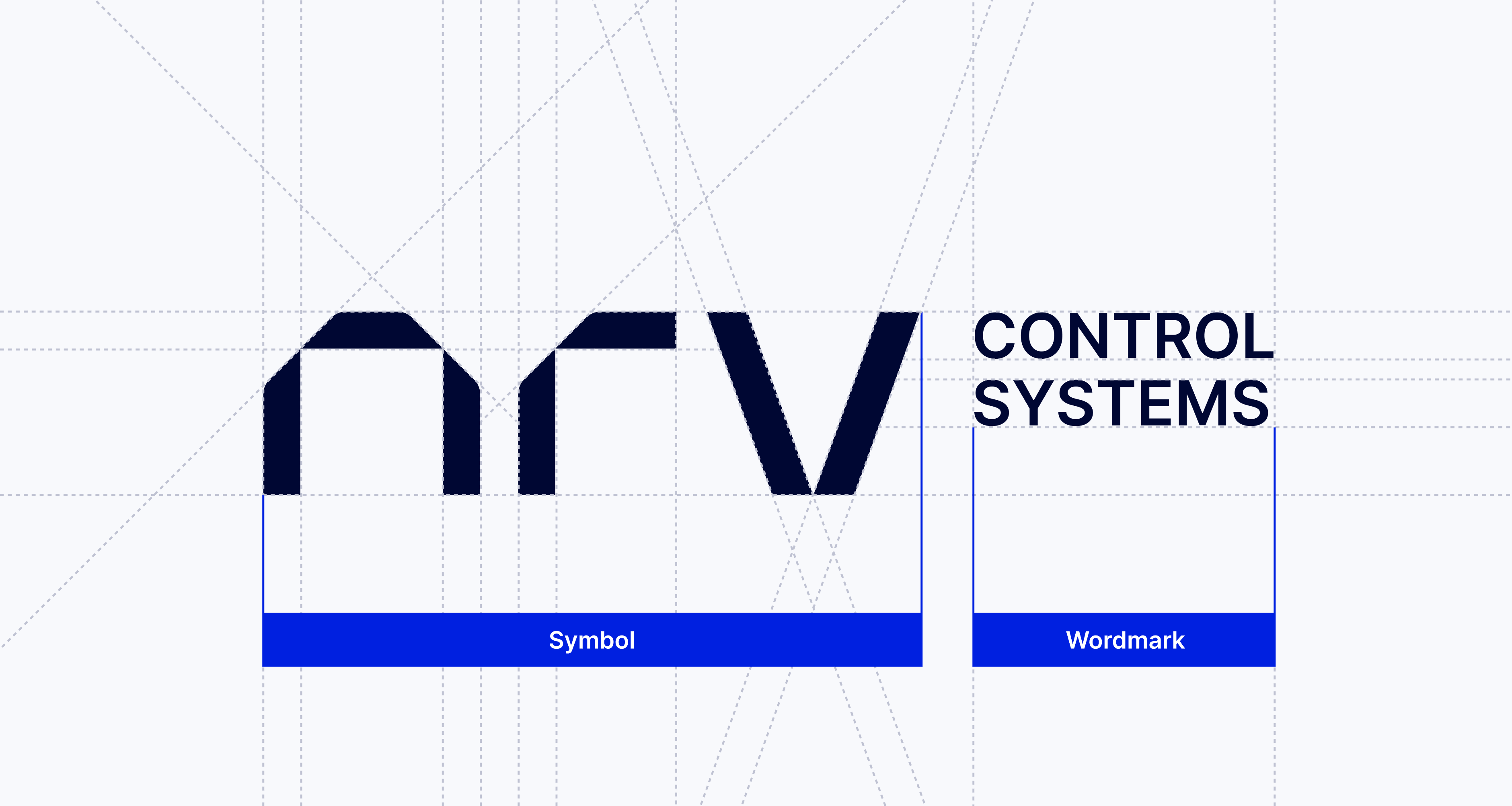
Security providers routinely rely on shield icons, padlocks, or network nodes. We bypassed these visual tropes to construct a distinctive typographic signet. Out of three proposed directions, NRV selected our primary path due to its structural stability.
Translating this structural approach into typography, the mark uses customized lowercase letterforms built on strict geometric cuts. To lock in their market context, we placed the Control Systems descriptor in the upper right quadrant. This placement adds visual tension while clearly defining their core enterprise service.
04 / [SYSTEM]
Technical Typography and Applied Spatial Concepts
To restore order across brand assets, we specified Archivo as the core typeface. Its industrial proportions maintain legibility across both print proposals and digital views. The palette relies on a deep technical blue supported by neutral tones, establishing visual hierarchy for technical documentation.
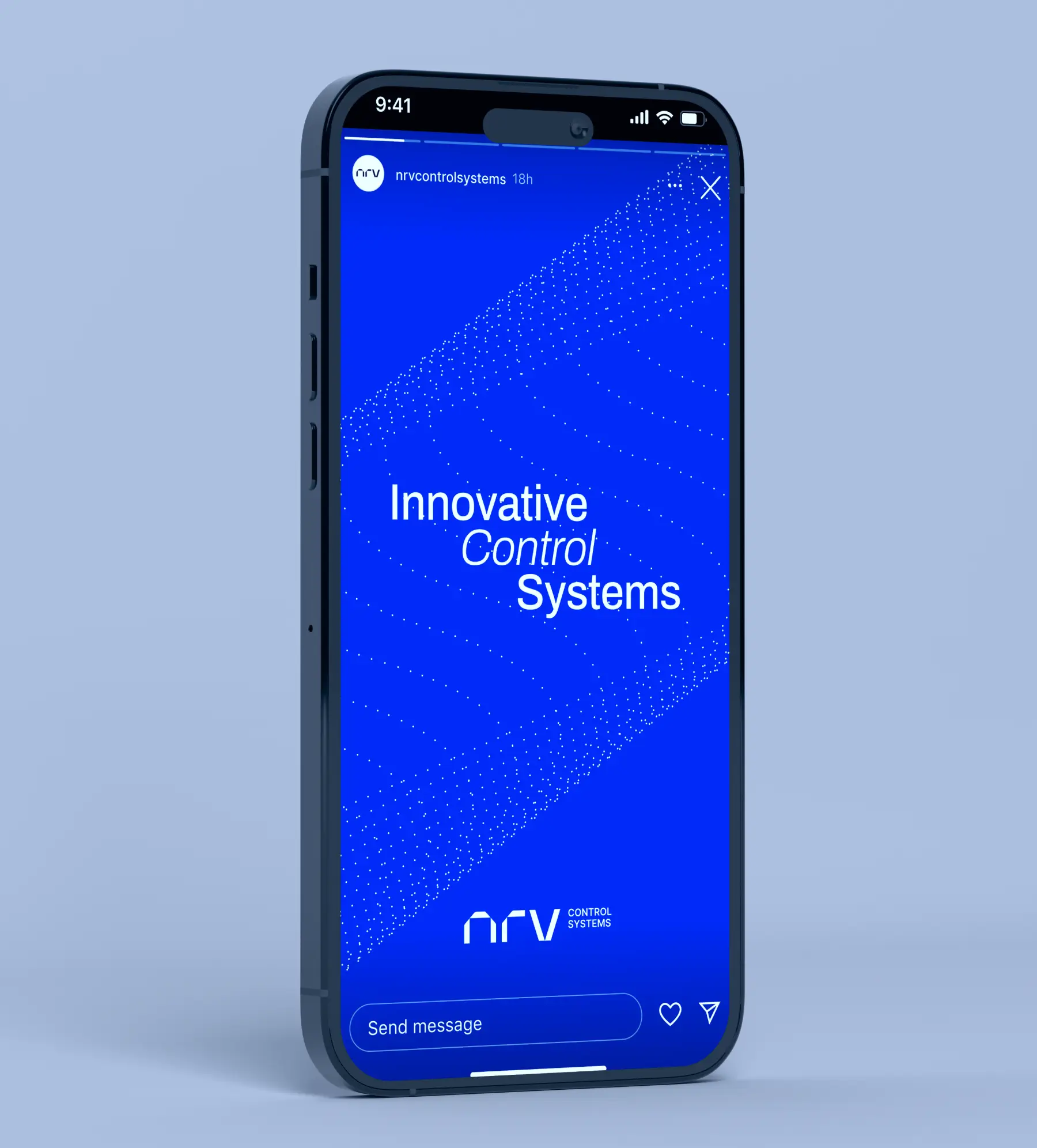
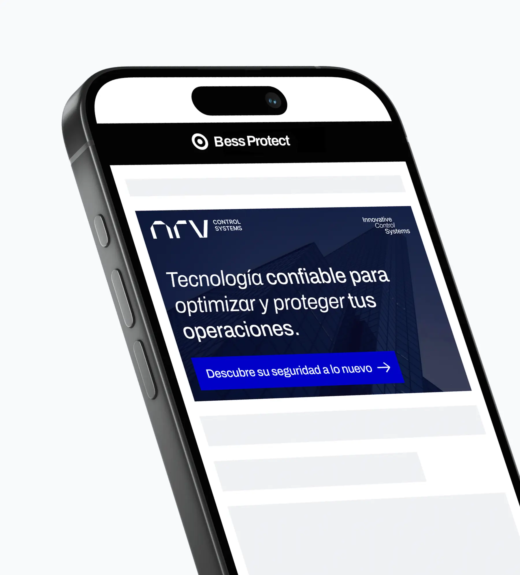
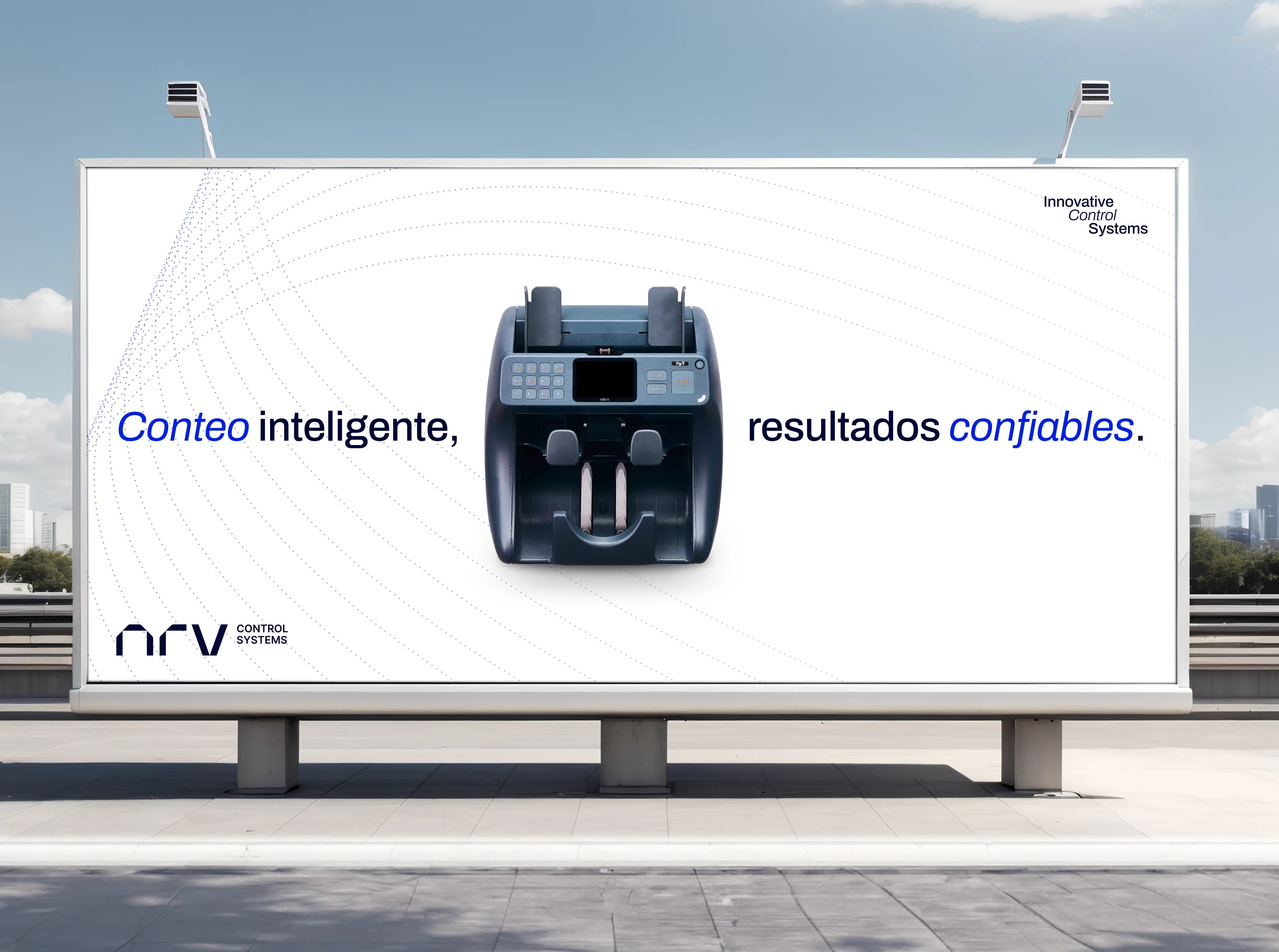
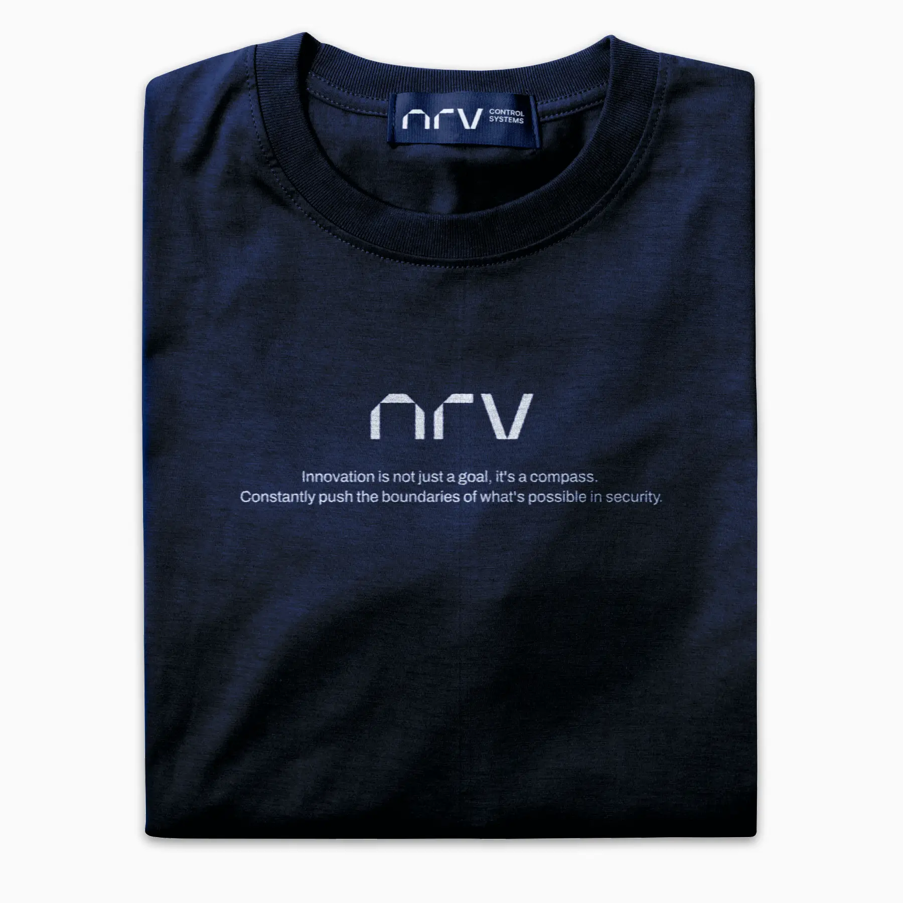
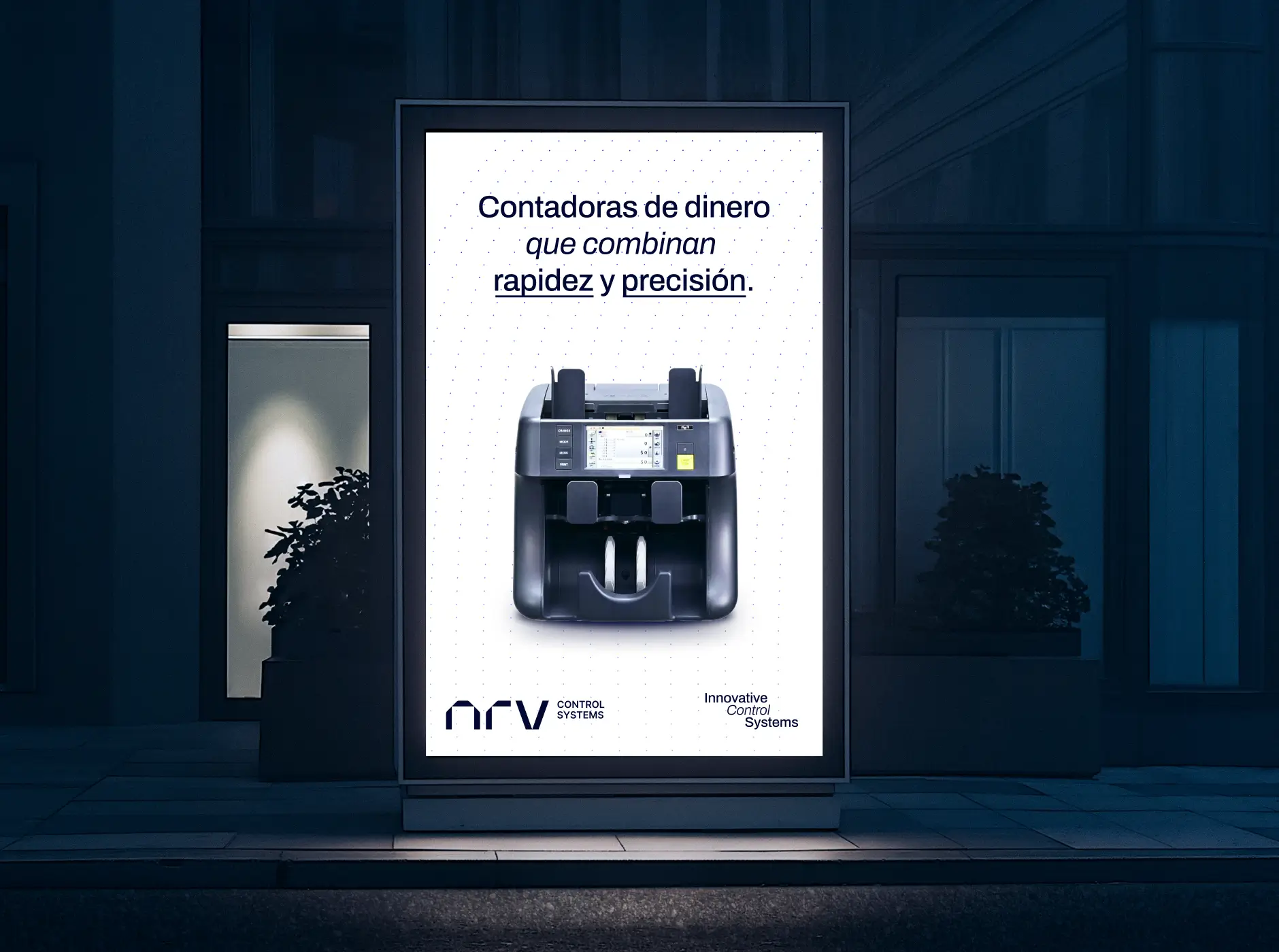
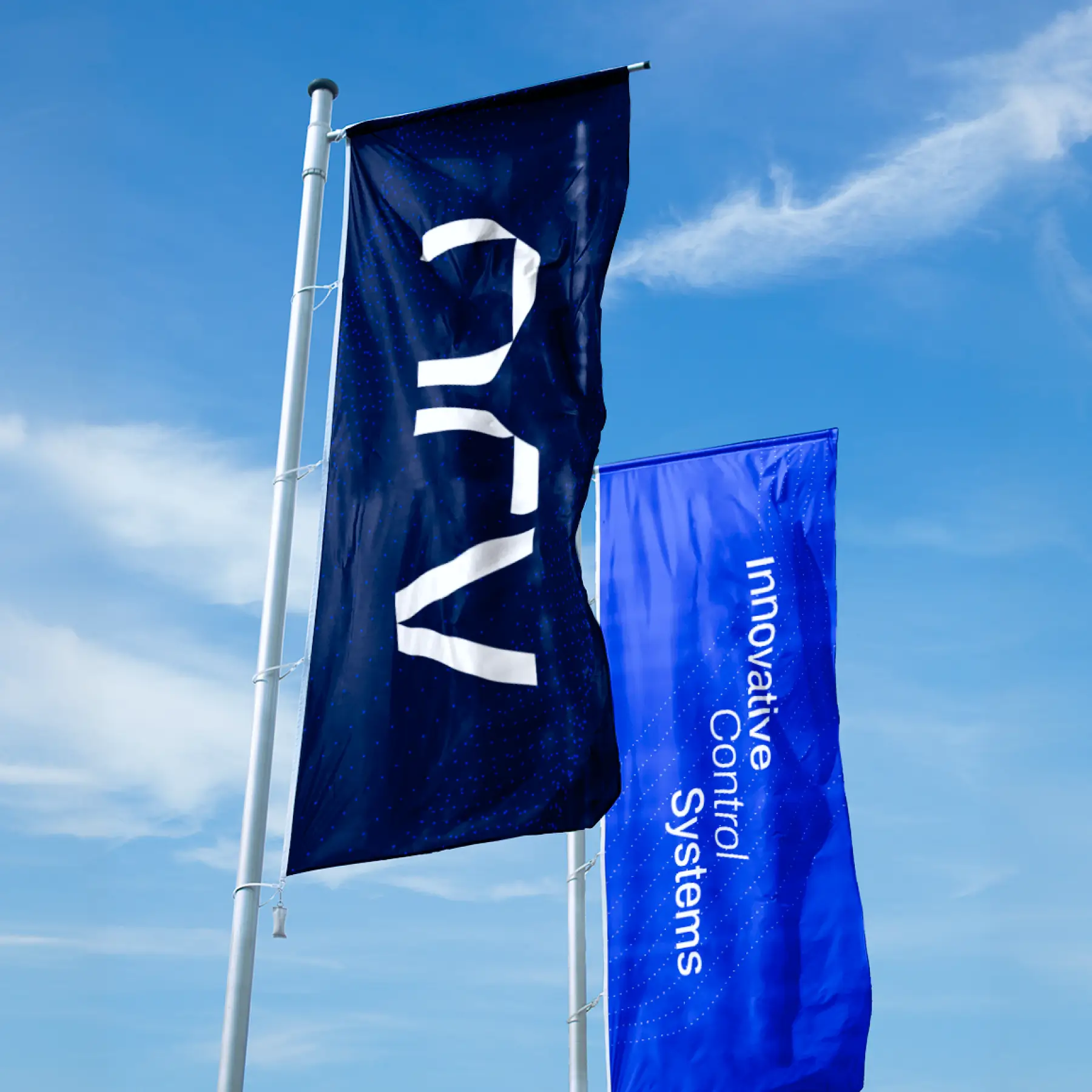
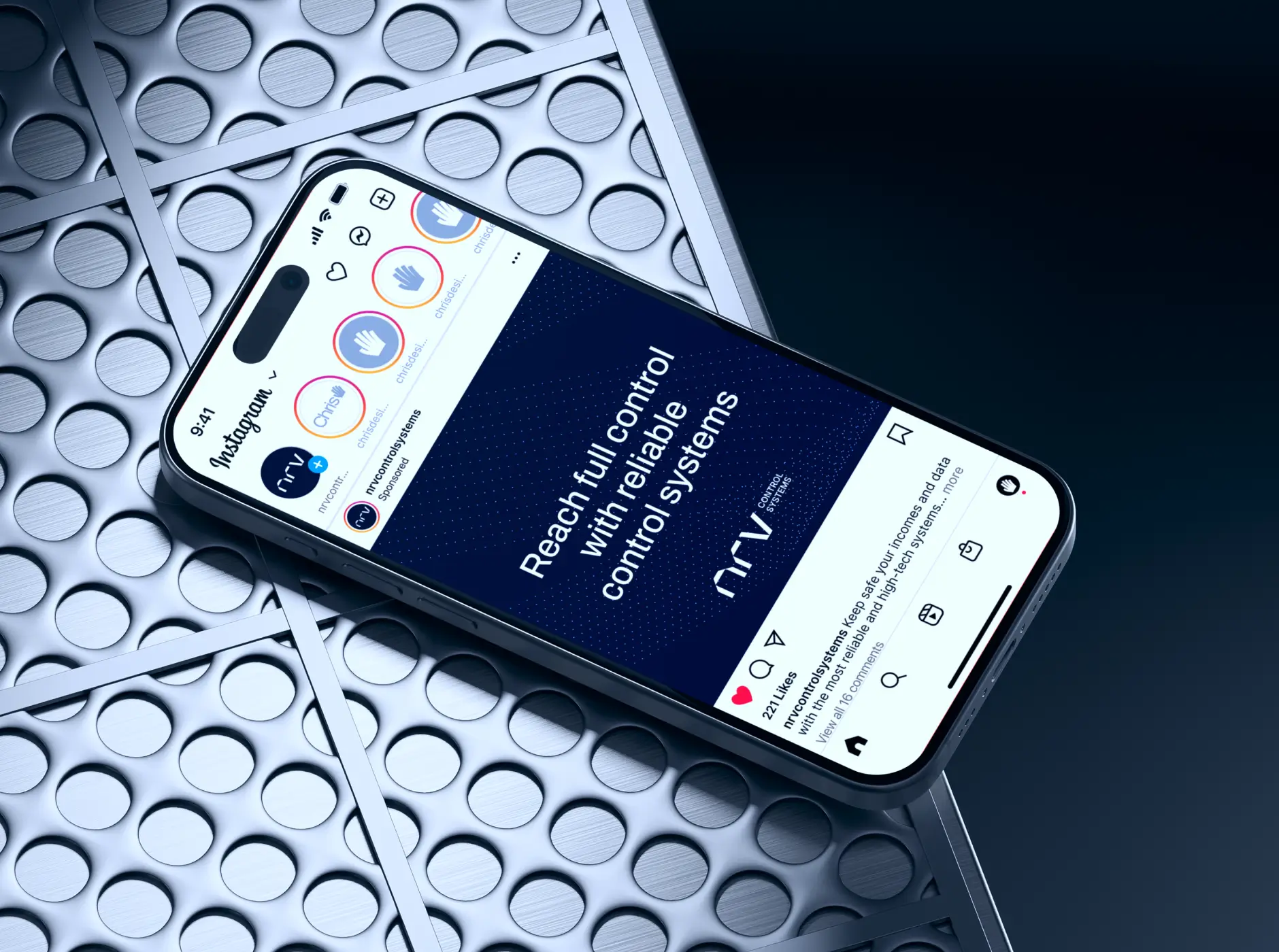
Extending these visual rules into real-world environments, we developed a series of physical application concepts. We created mockups for service vehicle fleet wraps, field staff apparel, signage, and corporate stationery. These spatial renders provided a clear preview of brand presence without unnecessary technical drafting.
05 / [DELIVERY]
Pragmatic Workflow Handoff and Operational Tools
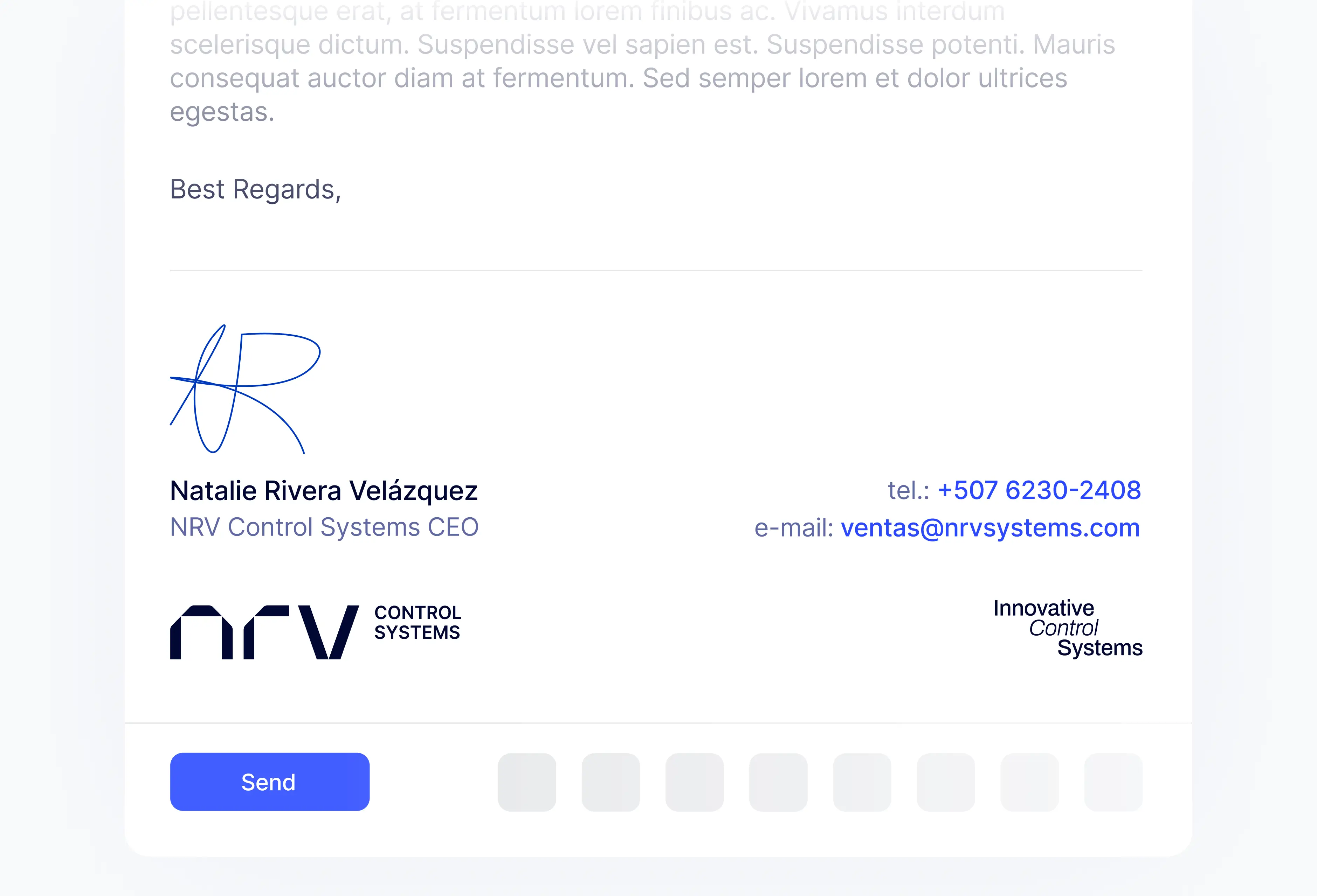
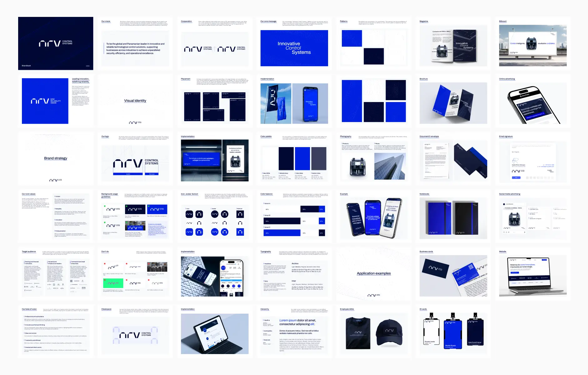
We tailored our deliverables to align with NRV’s actual operational environment. We compiled a functional Brand Book covering core assets, rules, and typography, alongside vector and raster file exports.
To support these guidelines in daily practice, we addressed their internal production habits. Because NRV produces daily assets in Canva, we provided native templates alongside our primary Figma source files. We delivered interactive motion files built in Rive and conducted an onboarding walkthrough for their staff. This setup allows their internal team to maintain consistency independently.